How to create a Custom Letter Template
A Custom Letter is a common use of Templates: taking data from Informer and adding it to a custom-styled HTML or PDF document. Most of the styling is done in the style.css Component. This article explains the parts of style.css and how they interact in a Custom Letter Template.
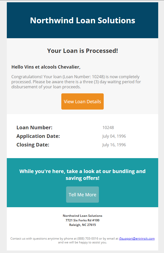
-
Create a blank Template by clicking + New and selecting Templates under Reports. Enter a name and optional description, then click Save.
-
Add a Dataset by clicking the + button next to Processors, selecting Dataset, choosing the Dataset, and clicking Save. This example uses Northwind Orders.
-
Create a Power Script to reference the context variables from the Dataset. Click the + button next to Processors and select Power Script:
$ctx.loans = northwindOrders.records.filter(r => r.orderId === inputs.loanNumber); -
Add an Input by clicking the + button next to Inputs and selecting Input Box under the Numeric menu. For this example, the Input is named
loanNumber. -
Fill in
template.njkwith the HTML for the letter. Open the Code View and paste in your letter markup. -
Edit the
style.cssfile to format the Template.
Example CSS
body {
    background-color: #eee;
    font-family: 'open sans', 'helvetica neue', helvetica, arial, sans-serif;
}
.container {
    background-color: #f7f7f7;
    width: 600px;
    margin: auto;
}
.header {
    background-color: #044767;
    text-align: center;
    padding: 25px;
    height: 15%;
    width: 100%;
}
.header h1 { color: #fff; }
.introduction { width: 100%; padding: 15px; }
.introduction h1 { line-height: 30px; font-size: 24px; font-weight: bold; color: #333333; }
.introduction .hello { line-height: 22px; font-size: 18px; font-weight: bold; color: #333333; }
.introduction .main { line-height: 20px; color: #777777; font-size: 16px; }
.mb-button-orange a {
    text-decoration: none; color: #ffffff; font-size: 18px;
    border-style: solid; border-color: #ed8e20; border-width: 20px 10px;
    display: inline-block; background: #ed8e20; border-radius: 5px;
}
.mb-button-teal a {
    text-decoration: none; color: #ffffff; font-size: 18px;
    border-style: solid; border-color: #66b3b7; border-width: 10px 20px;
    display: inline-block; background: #66b3b7; border-radius: 5px;
}
.details { background-color: #fff; width: 100%; border: 0px; padding: 35px; }
.details .item { line-height: 30px; font-size: 20px; font-weight: bold; text-align: left; color: #333333; }
.details .value { color: #777777; font-size: 16px; text-align: right; }
.referral { background-color: #1b9ba3; width: 100%; height: 10%; padding: 15px; text-align: center; }
.referral .main { font-size: 20px; font-weight: bold; color: #ffffff; }
.footer { background-color: #fff; text-align: left; padding: 10px; }
.footer .address { line-height: 18px; color: #333333; font-size: 12px; font-weight: bold; }
.footer .notice { padding-top: 25px; line-height: 15px; color: #777777; font-size: 12px; }
The pieces work together as follows:
- body: sets the background color to a cool gray and loads the font families used in the Template. All colors are hex codes.
- .container: holds all subsequent items so they do not expand to fill the recipient's screen. The 600px width keeps everything the same size regardless of who is viewing it, and
margin: autocenters it. - .header: sets a dark-blue background, center-aligned text, and padding. It uses percentages for height and width so the header is always 15% of its container's height and as wide as the container. The
h1style sets the font color to white. - .introduction: sets width and padding, then defines
h1,hello, andmainstyles.line-heightsets the height of the text content area,font-sizethe height of the font,colorthe text color, andfont-weightthe stroke thickness. - .mb-button-orange a and .mb-button-teal a: create buttons for hyperlinks. The
ain the name is necessary for the hyperlinks to work.display: inline-blockcreates the button; the rest is styling.border-colormatches the background to make the button appear seamless, andborder-radiusrounds the corners. - .details: a new element for Template details, such as the loan number, application date, and closing date.
- .referral: holds referral information and the teal button.
- .footer: styles the footer's address and notice text.
Finally, here is an example of how these elements are used in template.njk:
<table class="introduction">
    <tr>
        <td align="center">
            <h1>Your Loan is Processed!</h1>
        </td>
    </tr>
    <tr>
        <td align="left">
            <p class="hello">
                Hello {{ loans[0].shipName }},
            </p>
            <p class="main">
                Congratulations! Your loan is now completely processed. Please be
                aware there is a three (3) day waiting period for disbursement of
                your loan proceeds.
            </p>
            <center>
                <span class="mb-button-orange"><a href="https://en.wikipedia.org/wiki/Loan" target="_blank">View Loan Details</a></span>
            </center>
        </td>
    </tr>
</table>
This creates a table styled as an introduction element and uses the h1 formatting for "Your Loan is Processed!". It then adds a row with a hello paragraph that greets the customer by name (retrieved from the connected Dataset), a main paragraph for the body text, and the orange button that links to additional information.