Trend Table
Seeing how data changes over time can be difficult. A Trend Table lets you visualize the change in a Dataset over a specific time period and easily see those changes with custom colors.
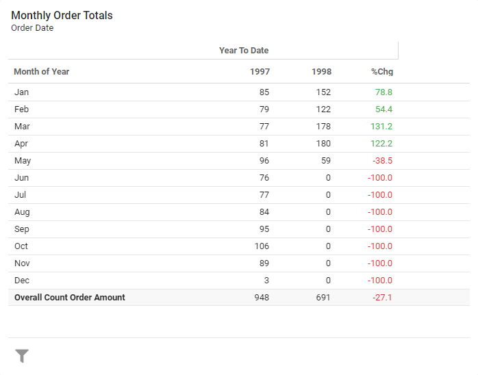
For example, the Trend Table below shows the change in the monthly order count between two years. The overall order count for 1998 started much higher in the first five months than in 1997 before dropping off.
Adding a Trend Table
To configure a Trend Table, open the Report containing it, click the ... icon in the top-right corner of the Visual, and select Configure. The left panel has four tabs: Series, Settings, Colors, and Drilldown.
Series
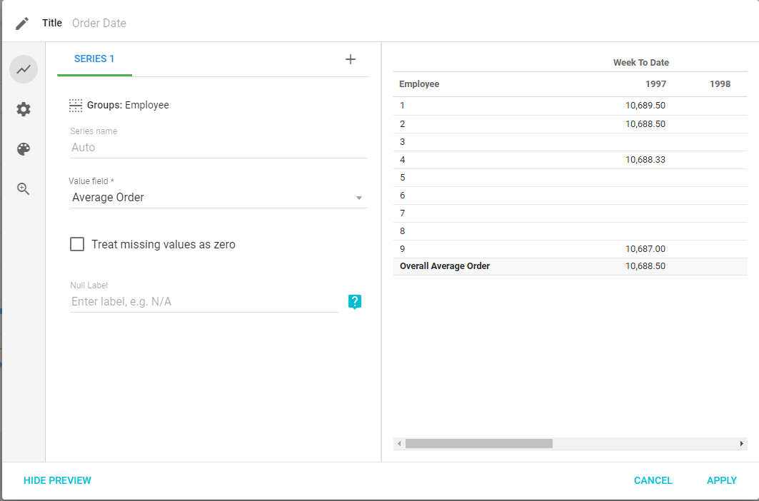
- Title: name the Trend Table in the text field next to Title.
- Series: click the + button to add additional series to the Visual.
- Groups: select the data that is compared on the Trend Table.
- Series Name: name the specific series of data.
- Value Field: the value the trend uses to calculate the desired change.
- Treat Missing Values as Zero: sets missing values to 0 for the purpose of calculating the trend.
- Null Label: sets a custom value to treat missing values as.
Settings
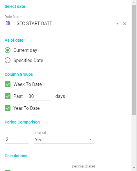
- Date Field: the Date Field over which a comparison is made.
- As of Date: compare the data as of the current date or a specific date.
- Column Groups: add columns that compare the trend change over Week to Date, a specified number of days, or Year to Date.
- Period Comparison: the number of years to add to the Trend Table. Anything over two years adds a running average and compares the final year to that average.
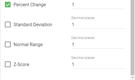
- Calculations: change or add calculations displayed on the table. The decimal places field adjusts the significant figures.
- Percent Change: displays the percentage change over the specified date ranges.
- Standard Deviation: displays the amount the data varies from the average.
- Normal Range: displays the interval within which 95% of the data lies.
- Z-Score: displays the number of deviations the data lies from the average.
Colors
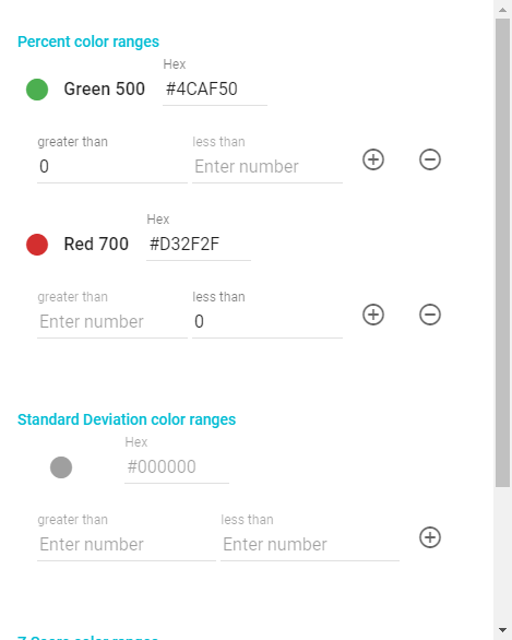
The Colors panel alters the colors displayed on the Trend Table. Clicking the color dot opens a dropdown to select a specific color, or you can enter a hex code. Entering numbers in the greater-than and less-than fields selects the range displayed in the chosen color. The plus and minus buttons add or remove a color range.
Drilldown
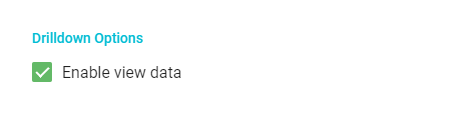
- Enable view data: adds Pivot by and View data options when a User clicks a cell.