Pie Charts
A Pie Chart is a Visual divided into slices to illustrate numerical proportions. The arc length of each slice is proportional to the quantity it represents, making Pie Charts particularly useful for expressing a part-to-whole relationship.
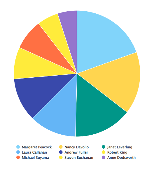
For example, the Pie Chart below shows orders separated by salesperson, letting Users easily see which salesperson has the largest portion of overall sales.
Settings
To configure a Pie Chart, open the Report containing the chart, click the ... icon in the top-right corner of the Visual, and select Configure. The left panel has five tabs: Settings, Series, Y-Axis, Legend, and Drilldown.
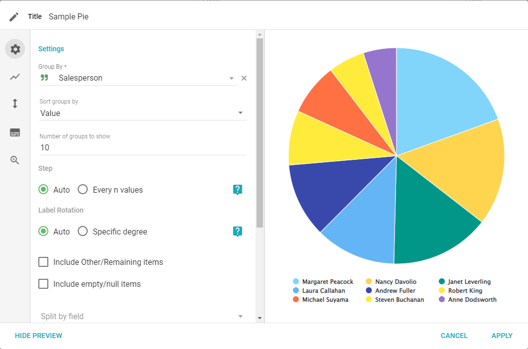
- Group by: select a Field to use for the slices of the chart.
- Sort groups by: choose how to sort the groups.
- Number of groups to show: the maximum number of individual groups shown in the chart.
- Include other/remaining items: creates a group for all values not included in the number of groups to show. Available for both Group By and Split By.
- Include empty/null items: creates a group for null or empty values.
- Split by field: choose a Field to create a second group to analyze the data (for example, Group by Company, Split by Product).
- Sort Split by Field By: Value, Sub-Group Ascending, or Sub-Group Descending.
- Step, Label Rotation, Zoom, Stacking, and X-Axis title: these settings are not available in a Pie Visual.
Series
The Series tab lets you edit the displayed data or add additional series. Four icons at the bottom of the panel are Series, Color, Label, and Delete.
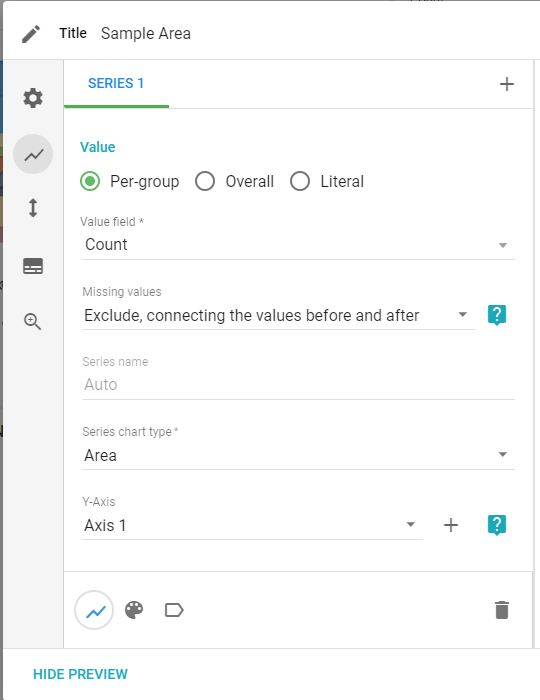
- Value Type: Per-group (a series for every value in a Field), Overall (one series for an overall aggregate), or Literal (one literal value, such as a goal).
- Value Field: sets the type of aggregate value to calculate for the series.
- Series name: changes the name of the series in the legend.
- Series chart type: changes the type of chart being used.
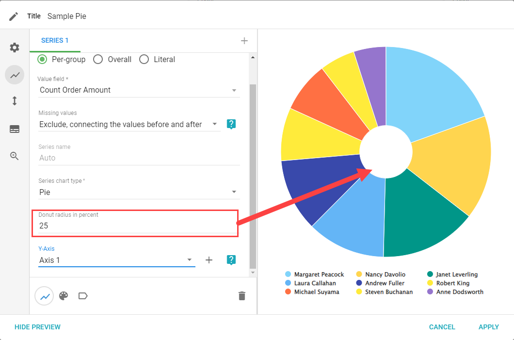
- Donut in Radius: changes the size of the white circle in the middle of the Visual, turning the Pie into a Donut.
- Missing Values and Y-Axis: these settings are not available in a Pie Visual.
Color
The Color tab lets you change the display colors for the selected series.
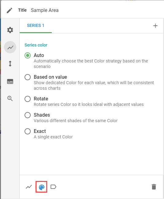
- Auto: Informer chooses the best color strategy.
- Based on Value: matches colors associated with other charts and the same values.
- Rotate: rotates series color so it complements adjacent colors.
- Shades: select a color and Informer displays various shades of it.
- Exact: select an exact color for a value.
Labels
The Labels tab lets you change how the data is labeled and displayed.
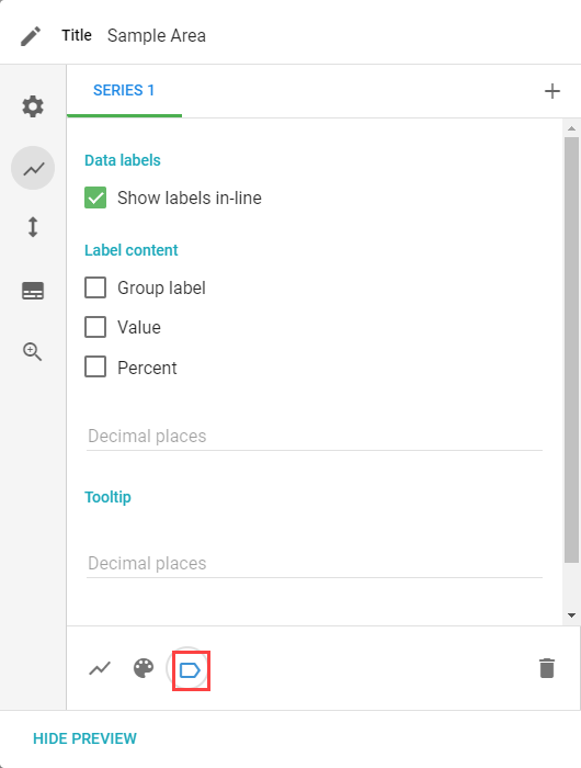
- Show labels in-line: adds labels to the slices.
- Label content: show the group label, value, and/or percent of each group.
- Decimal Places: how many digits after the decimal to show.
- Tooltip: formats the information shown when hovering over a slice.
Y-Axis
The Y-Axis settings are not available for Pie Charts.
Legend
The Legend tab lets you set if and how a legend is displayed.
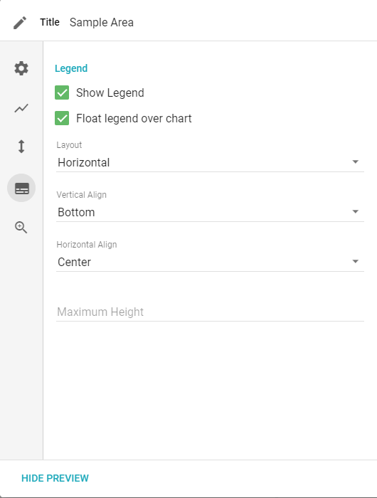
- Show Legend: toggles whether to show a legend.
- Layout: changes the orientation of the legend between horizontal and vertical.
- Float legend over chart: places the legend on top of the chart.
- Vertical Align: top, middle, or bottom.
- Horizontal Align: left, center, or right.
- Max height: the maximum height of the legend in pixels.
Drilldown
The Drilldown tab lets you configure what data, if any, is available to drill down or pivot on from the Visual.
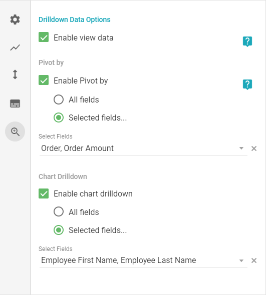
- Enable view data: enables the View data and Pivot by options.
- Pivot by: enables the Pivot by option for the Visual.
- Chart Drilldown: enables the Drilldown by option to split data by a given Field (All Fields or Selected Fields).