Line, Spline, and Area Charts
A Line Chart plots data values as points along the X and Y axes, connected by line segments. Line Charts give the clearest graphical representation of time-dependent variables and are the preferred way to show trends over a period of time. A Spline Chart is a Line Chart that uses curves instead of straight lines, emphasizing trends in a smoother, more gradual way. An Area Chart is a Line or Spline Chart that emphasizes the area between the axis and the line with color, commonly used to compare two or more quantities.
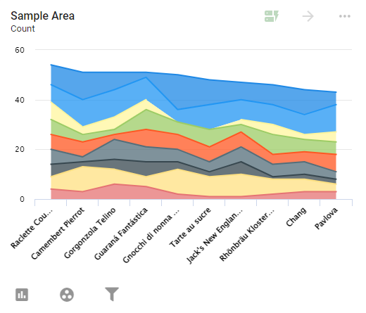
For instance, the Area Chart below shows which products are being sold, split by the employee who sold them, letting Users see who is selling the most of each product.
Settings
To configure a Line, Spline, or Area Chart, open the Report containing the chart and click the ... icon in the top-right corner of the Visual. Select Configure to open the Configure Visual window. The left panel has five tabs to customize the Visual: Settings, Series, Y-Axis, Legend, and Drilldown. To name the chart, enter a name at the top of the window next to Title.
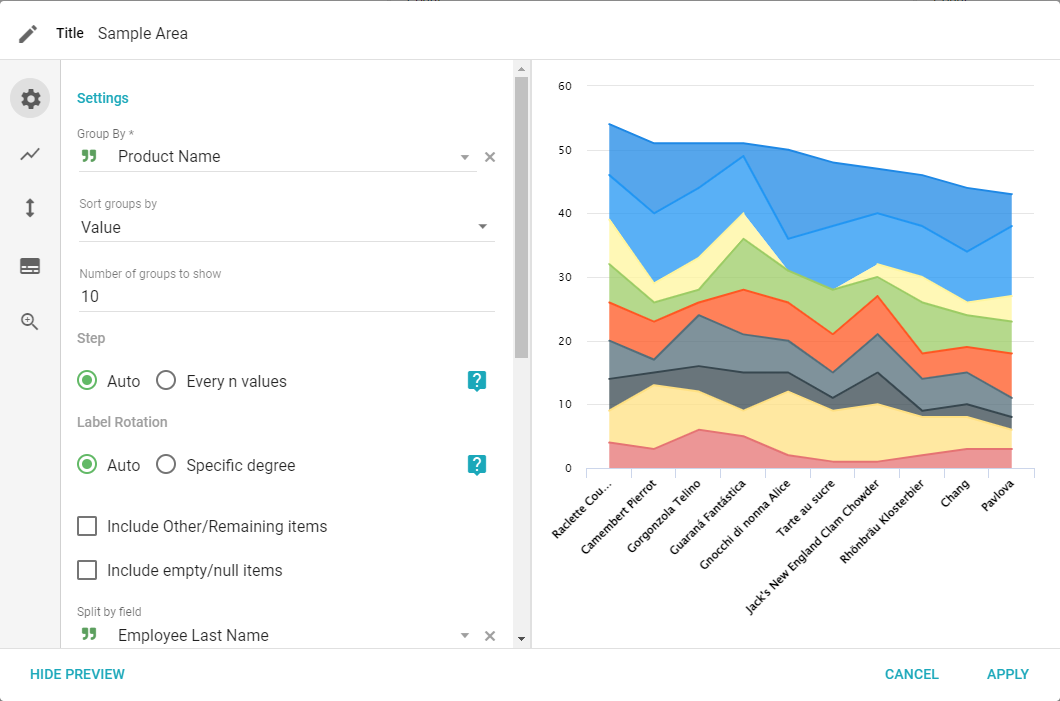
- Group by: select a Field to use for the x-axis of the chart.
- Sort groups by: choose how to sort groups along the x-axis.
- Value: sorts by the value of the aggregate, largest to smallest.
- Group Ascending: alphabetical order by group column name.
- Group Descending: reverse alphabetical order by group column name.
- Number of groups to show: the maximum number of individual groups shown in the chart.
- Step: display all labels or step by increments. Setting the step to 2 shows every other label, for instance. By default, the step is calculated automatically to avoid overlap. To prevent this, set it to 1.
- Label Rotation: sets the angle of the X-axis group labels. By default, labels auto-rotate so they all fit. If Specific degree is chosen, the value defaults to -45 degrees.
- Include other/remaining items: creates a separate group for records not displayed. (If the number of groups to show is 10 and there are more than 10, this displays the remaining data.) This option allows renaming the column.
- Include empty/null items: creates a separate group for empty or null values. This option allows renaming the null column and is available for the Group By and Split By columns.
- Split by field: choose a Field to split groups, visually displaying a second group inside the chart.
- Sort Split by Field By: choose how to sort the splits (Value, Sub-Group Ascending, or Sub-Group Descending).
- Number of sub-groups to show: the maximum number of sub-groups to split each group into.
- Zoom: set the zoom on the x-axis, y-axis, or both.
- Stacking: changes how the group and split-by columns display. Stacking only applies to bar and column chart types. With multiple series, only normal stacking is supported.
- None: no stacking, good for comparing values within a single group.
- Normal: stacks groups on top of each other, showing the total of split-by groups separated by color.
- Percent: shows what percentage each sub-group makes up of its group.
- X-Axis title: supplies a label for the x-axis.
- Polar Chart: changes the chart's display to a circular chart showing the same data. See Polar Charts.
Series
The Series tab lets you edit the value of the displayed data or add additional series. Four icons at the bottom of the panel are Series, Color, Label, and Delete. Delete removes the current series; the others show different settings for it.
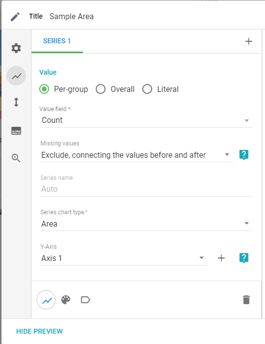
- Add aggregate: adds a new series to the chart (the + sign next to Series 1).
- Value Type: select which type of value to show with the series.
- Per-group: calculates aggregate values for each group.
- Overall: calculates aggregate values for the entire Dataset.
- Literal: adds a horizontal line at a given value.
- Value Field: sets the type of aggregate value to calculate for the series.
- Missing Values: skips null or zero values in groupings, allowing a continuous line if the aggregate of the group is zero or null. This applies only to Line, Spline, and Area chart types.
- Series name: changes the name of the series in the legend.
- Series chart type: changes the type of chart being used.
- Y-Axis: choose which y-axis to use for the series, or add a new one. If series are on vastly different scales, add a Y-Axis.
Color
The Color tab lets you change the display colors for the selected series.
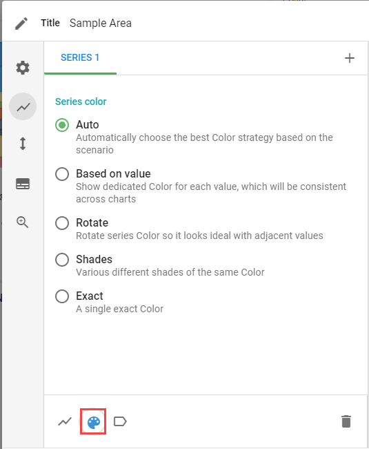
- Auto: Informer chooses the best color strategy based on the current settings.
- Based on Value: tries to match colors associated with other charts and the same values.
- Rotate: rotates series color so it complements adjacent colors.
- Shades: select a color and Informer displays various shades of it.
- Exact: select an exact color for a value.
Labels
The Labels tab lets you change how the data in the chart is labeled and displayed.
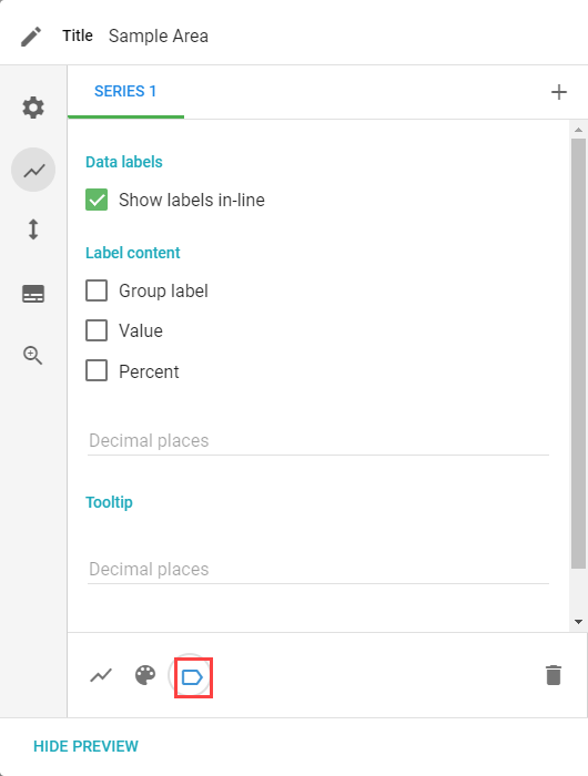
- Show labels in-line: adds labels to the data points in the chart.
- Label content: choose whether to show the group label, value, and/or percent of each group.
- Decimal Places: how many digits after the decimal to show.
- Tooltip: formats the information shown when hovering over a group in the chart.
Y-Axis
The Y-Axis tab lets you set the label of the y-axis and how data displays based on type and scale.
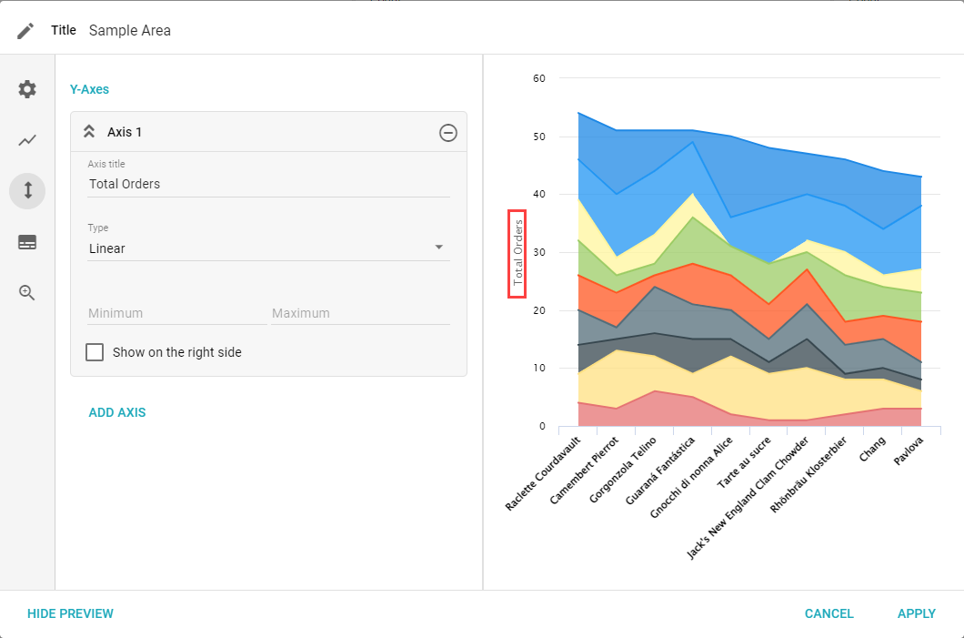
- Y-Axis: a list of y-axes added to the Visual. Click the down arrow to change settings for an individual axis.
- Axis Title: adds a title to the axis.
- Type: choose Linear, Logarithmic, Datetime, or Category.
- Minimum and Maximum: sets a minimum and maximum value for an axis, helping focus the view of the data.
- Show on Right Side: if checked, the axis displays on the right side of the Visual.
- Add Axis: adds a new y-axis to the Visual.
Legend
The Legend tab lets you set if and how a legend for the chart's data is displayed.
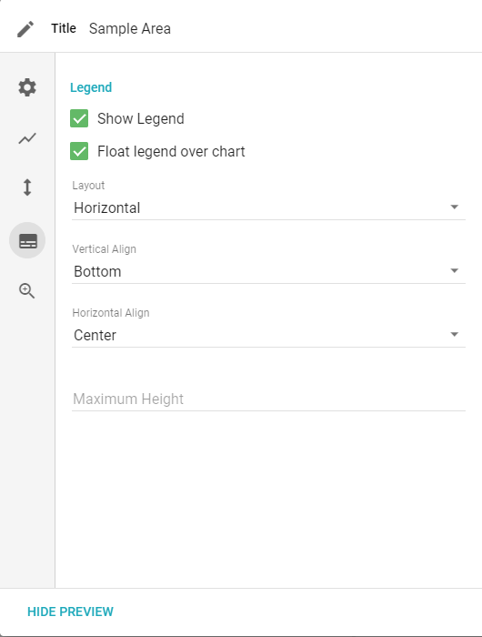
- Show legend: displays the legend on the Visual.
- Float legend over chart: places the legend on top of the chart instead of resizing the chart to make room.
- Vertical Align: moves the legend to the top, middle, or bottom.
- Horizontal Align: moves the legend to the left, center, or right.
- Maximum Height: the maximum height of the legend in pixels.
Drilldown
The Drilldown tab lets you configure what data, if any, is available to drill down or pivot on from the Visual.
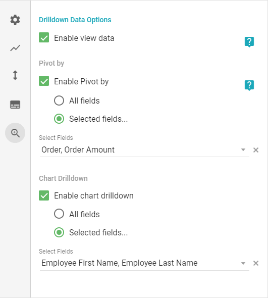
- Enable view data: enables the View data and Pivot by options to drill into data or create Pivot Tables based on columns in the Dataset.
- Pivot by: enables the Pivot by option for the Visual. This can limit the pivot Fields available from a specific Visual.
- Chart Drilldown: enables the Drilldown by option to split data by a given Field. This can limit the drilldown Fields available from a specific Visual.
- All Fields: allows drilling down to all Fields in the Dataset.
- Selected Fields: choose which Fields are available to drill down on.