Heat Maps
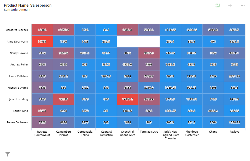
A Heat Map is a graphical representation of data where the individual values in a matrix are represented as colors. Heat Maps are versatile and efficient at drawing attention to trends. While other visualizations must be interpreted, Heat Maps are innately self-explanatory.
Settings
To configure a Heat Map, open the Report containing the chart, click the ... icon in the top-right corner of the Visual, and select Configure. The left panel has four tabs: Settings, Color, Legend, and Drilldown.
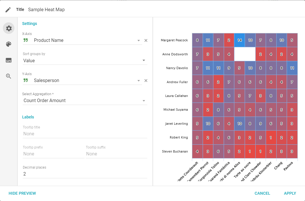
- X-Axis: select a Field to use for the x-axis of the chart.
- Sort groups by: choose how groups are sorted along the x-axis (Value, Group Ascending, or Group Descending).
- Y-Axis: select a Field to use for the y-axis of the chart.
- Numeric Field: choose the numeric Field and the aggregate to display in the boxes.
- Labels: choose the Tooltip for hovering over the boxes (Title, Prefix, Suffix, and Decimal Places).
Color
The colors of a Heat Map represent the minimum and maximum values of the selected data. The closer a value is to the maximum, the closer that section is to the selected Maximum Color; the same is true for the minimum. Data closer to the average is a weighted color combination of the selected colors.
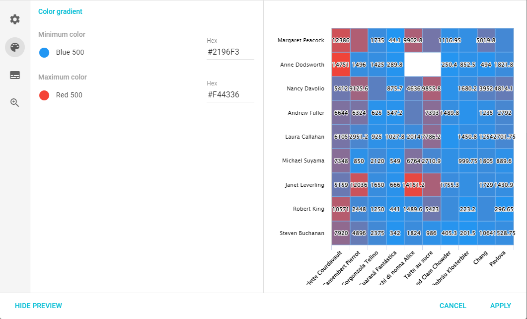
Choose colors either by entering the hex value or by clicking the color sample and selecting a preconfigured color from the list.
- Minimum Color: the color of the minimum value of the Heat Map data.
- Maximum Color: the color of the maximum value of the Heat Map data.
Legend
The Legend tab lets you change if and how a legend is displayed.
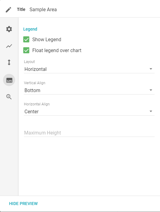
- Show legend: displays the legend on the Visual.
- Float legend over chart: places the legend on top of the chart instead of resizing it.
- Vertical align: top, middle, or bottom.
- Horizontal align: left, center, or right.
- Max height: the maximum height of the legend in pixels.
Drilldown
The Drilldown tab lets you configure what data, if any, is available to drill down or pivot on from the Visual.
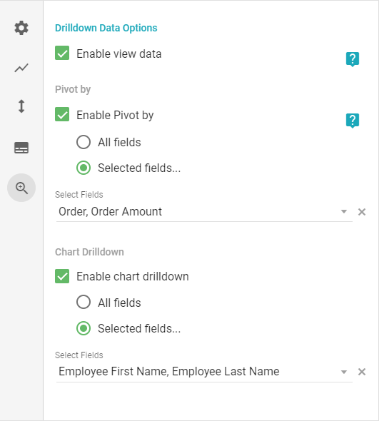
- Enable view data: enables the View data and Pivot by options.
- Pivot by: enables the Pivot by option for the Visual.
- Chart Drilldown: enables the Drilldown by option to split data by a given Field (All Fields or Selected Fields).