Trend Charts
Trend Charts show change over time. Use them to identify trends going up or down, special patterns, or unusual occurrences. For instance, a Trend Chart can show a steady increase in orders shipped over time until they drop off in a particular month.
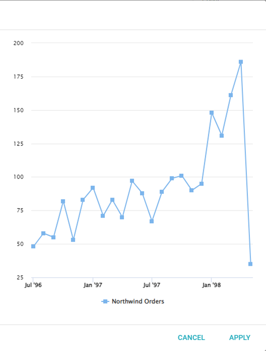
Series
To configure a Trend Chart, open the Report containing the chart, click the ... icon in the top-right corner of the Visual, and select Configure. The left panel has four tabs: Series, Settings, Y-Axis, and Legend. At the bottom of the Series panel are five icons: Series, Color, Labels, Drilldown, and Delete. To name the chart, enter a name at the top of the window next to Title.
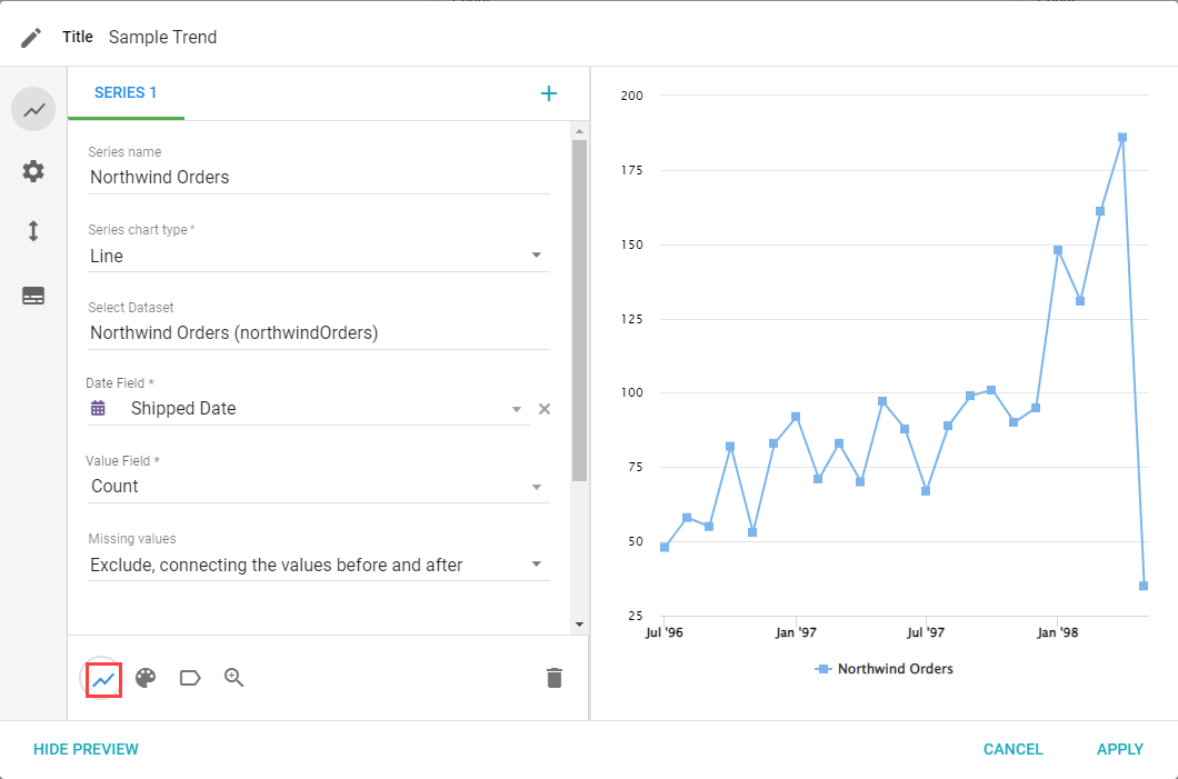
- Add Dataset: adds a new Dataset to the chart. Only Datasets associated with the Report can be added.
- Series name: changes the name of the series in the legend.
- Series chart type: changes the type of chart being used.
- Select Dataset: choose which Dataset has the data needed.
- Date Field: select a date Field to use for the x-axis of the chart.
- Value Field: sets the type of aggregate value to calculate for the series.
- Missing values: select which option to use when values for group dates are empty or null.
- Split by field: choose a Field to create a second group to analyze the data (for example, Group by Month, Split by Product).
- Number of sub-groups to show: the number of sub-groups to show on the chart.
- Stack split by: None, Normal, or Percent (when using a bar or column chart).
- Regression equation: select an equation to customize the regression line or curve on the chart.
- Y-Axis: configure which y-axis to use, or add a new one.
Color
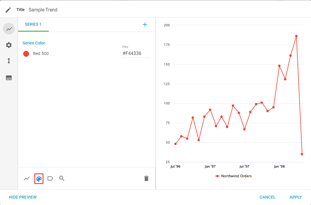
The series color sets the color scheme for each series. With no split-by, the choice is one color per series. With a split-by, the additional color strategies appear.
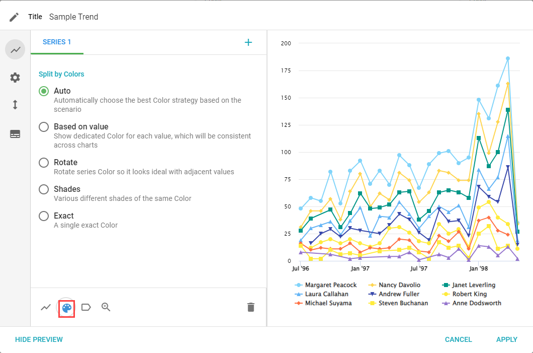
- Auto, Based on Value, Rotate, Shades, and Exact: the same color strategies as other charts.
Labels
The Labels tab lets you change how the data is labeled and displayed.
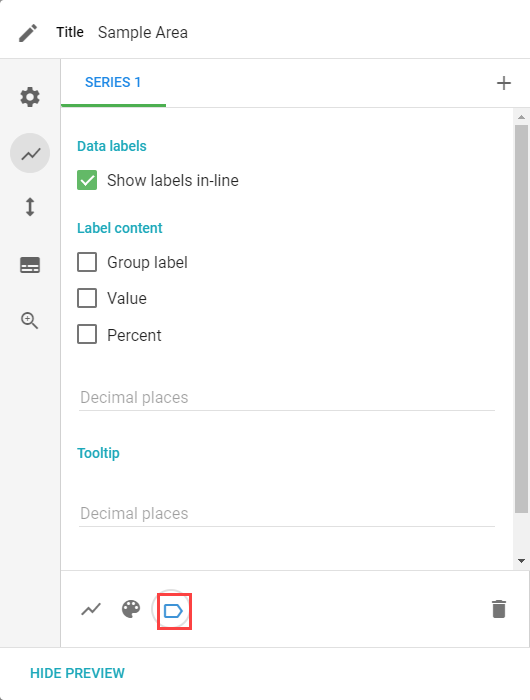
- Show labels in-line, Label content, Decimal Places, and Tooltip: the same label options as other charts.
Drilldown
The Drilldown tab lets you configure what data, if any, is available to drill down on from the Visual.
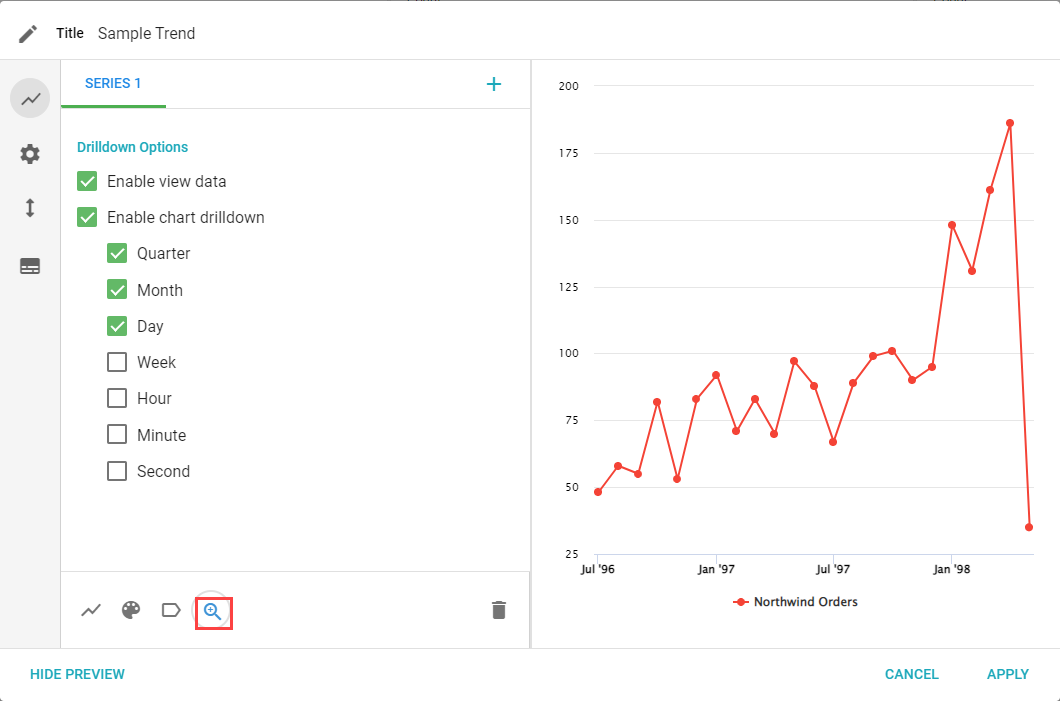
- Enable view data: enables the View data and Pivot by options.
- Enable chart drill-down: enables the Drilldown by option to split data by a given time frame.
Settings
The Settings tab lets you customize different parts of the Visual.
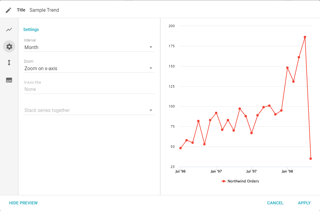
- Interval: choose what intervals divide the date or time Field.
- Zoom: configure the zoom on the x-axis, y-axis, or both. When viewing the Visual, highlight a spot on the chart to zoom into that section.
- X-Axis title: creates a label for the x-axis.
- Stack series together: changes how series are stacked when multiple series are added and using a bar or column chart.
Y-Axis
The Y-Axis tab lets you set the label of the y-axis and how data displays based on type and scale.
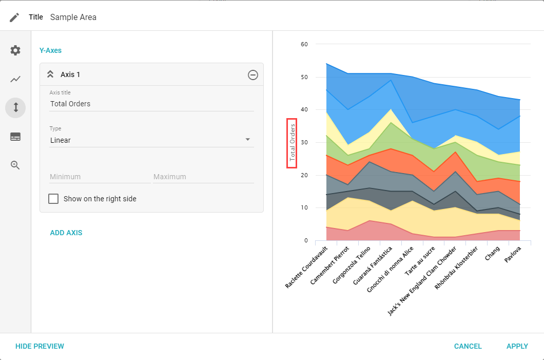
- Y-Axis, Axis Title, Type, Minimum and Maximum, Show on Right Side, and Add Axis: the same y-axis options as other charts.
Legend
The Legend tab lets you set if and how a legend is displayed.
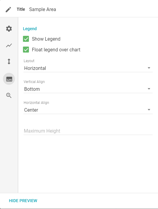
- Show legend, Float legend over chart, Layout, Vertical Align, Horizontal Align, and Maximum Height: the same legend options as other charts.