Maps
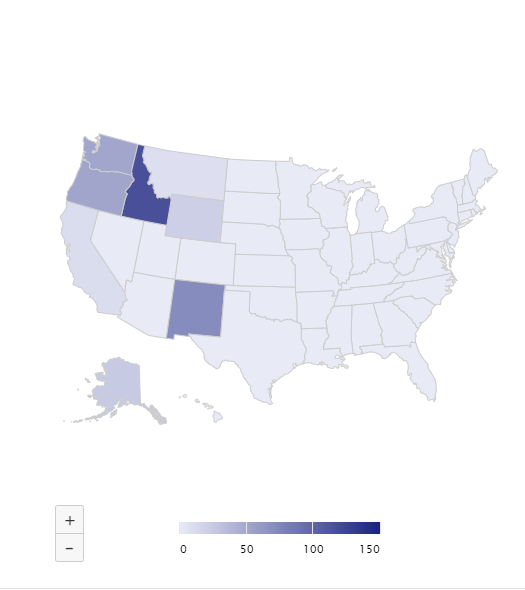
Map Visuals take any data from a result set associated with a location and overlay that data onto a map, broken down by country, state, or region. Maps are configurable depending on the specific location data in the result set. For instance, a Map can show which states received the most shipments.
Informer offers two types of Maps in Reports: Map Visuals and Google Maps.
Settings
To configure a Map Visual, open the Report containing the map, click the ... icon in the top-right corner of the Visual, and select Configure. The left panel has three tabs: Settings, Color, and Drilldown. To name the map, enter a name at the top of the window next to Title.
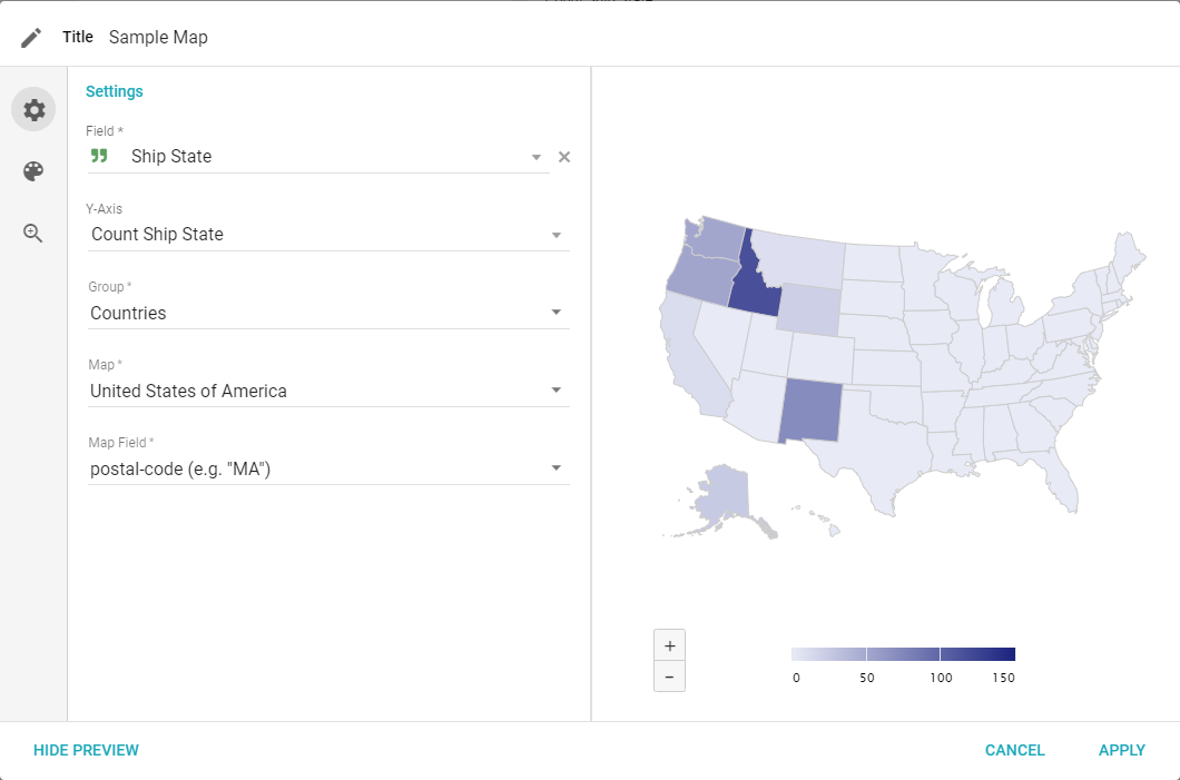
- Field: select the Field with the names of the regions to group by.
- Y-Axis: choose the aggregate for the value to view based on the groupings.
- Group: choose how to group the data based on the type of map:
- Congressional Districts: maps of the United States or an individual state divided by congressional district.
- Continents: maps showing individual continents.
- Countries: maps of individual countries with local states or provinces.
- Country Regions: maps of regions within a country that may have additional significance.
- States and Provinces: maps of individual states or provinces worldwide.
- World: maps of different projections of the world.
- World Regions: maps of regions containing countries that may have additional significance.
- Map: chooses a specific map based on the chosen Group.
- Map field: choose the format of the regions in the selected Field (for example, name or country code), depending on the format of the values in the Field.
Color
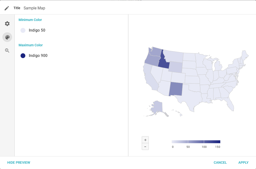
The Color tab lets you change the display colors. The colors represent the minimum and maximum values of the selected data: the closer a value is to the maximum, the closer that section of the map is to the selected Maximum Color, and the same is true for the minimum. Data closer to the average is a weighted color combination. Choose colors by clicking the color sample and selecting a preconfigured color.
- Minimum Color: the color of the minimum value of the data.
- Maximum Color: the color of the maximum value of the data.
Drilldown
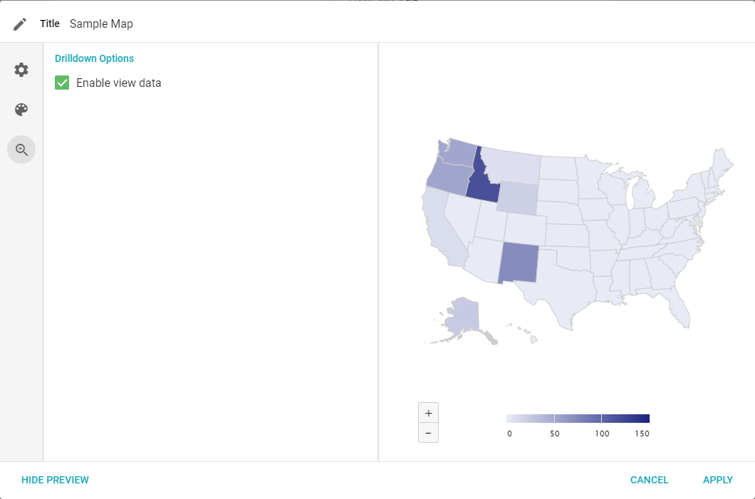
The Drilldown tab lets you configure what data, if any, is available to drill down on from the Visual. For Maps, Enable view data is the only option. It adds Pivot by and View data options when a User clicks a region on the map.
Google Maps
For Google Maps to appear as an option, an Administrator must apply a Google API key in the Administration settings under Features. The configuration settings for a Google Map are:
- Dataset: the Dataset with the data needed to create the map.
- Location: the Field containing the location of each record.
- Zoom: how far the map is zoomed in by default.
- Center Latitude and Longitude: the coordinates the map is centered on by default.
- Show heat: shows individual points for each record, with overlapping points changing from green to red depending on how many overlap.