Scatter Plots
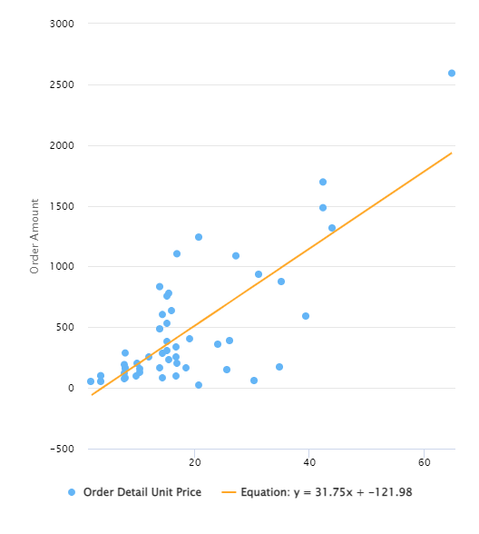
A Scatter Plot pairs numerical data, with one variable on each axis, to look for a relationship between them. If the variables correlate, the points fall along a line or curve; the better the correlation, the tighter the points hug the line.
For example, the Scatter Plot below shows the relationship between order amount and unit price, illustrating that, save for a few outliers, most orders are less than 500 units regardless of price.
Settings
To configure a Scatter Plot, open the Report containing the chart, click the ... icon in the top-right corner of the Visual, and select Configure. The left panel has three tabs: Settings, Color, and Legend. To name the chart, enter a name at the top of the window next to Title.
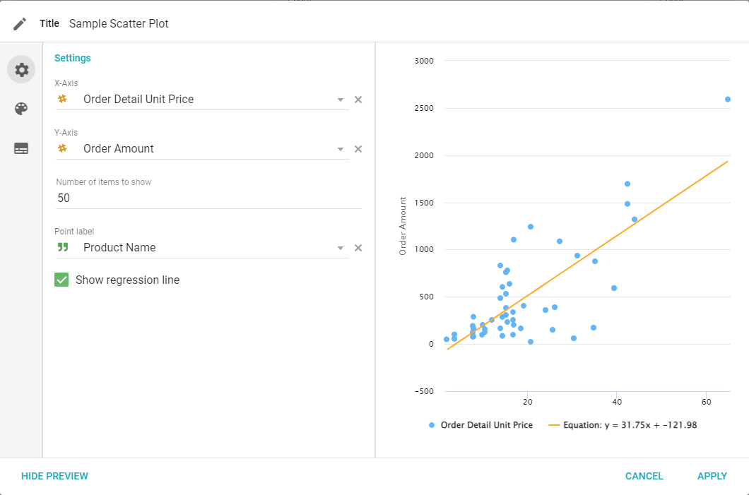
- X-Axis: select a Field to use for the x-axis of the chart.
- Y-Axis: select a Field to use for the y-axis of the chart.
- Number of items to show: the maximum number of individual data points shown.
- Point Label: choose which column value to display when hovering over a point.
- Show regression line: generates a regression line using the data in the chart.
Color
Configure the point and line colors for the Scatter Plot.
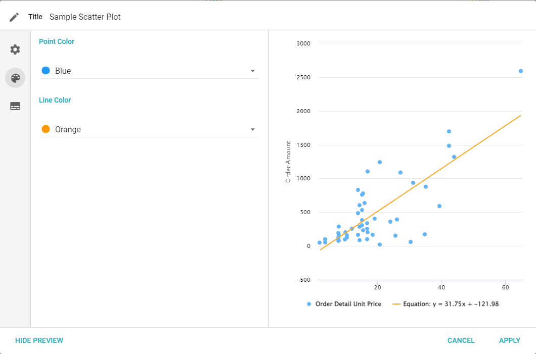
- Point color: changes the color of the points in the Visual.
- Line color: changes the color of the regression line, if one has been added.
Legend
Adjust how the legend displays on the graph.
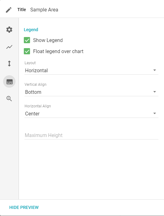
- Show Legend: toggles whether to show a legend.
- Float legend over chart: places the legend on top of the chart.
- Vertical Align: top, middle, or bottom.
- Horizontal Align: left, center, or right.
- Maximum Height: the maximum height of the legend in pixels.