Types of Visuals
Informer 5 offers a variety of Visual options to display the breakdown of underlying data in different ways.
Charts
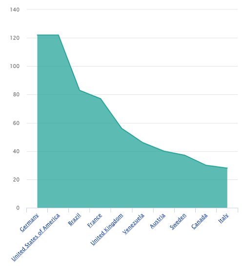
Area and Area Spline Charts display data points connected by straight lines, with color filled in the area underneath each line.
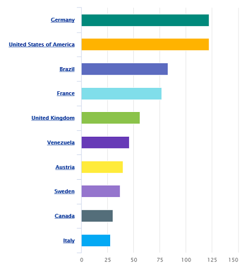
Bar Charts display horizontal bars to show categorical data, using the length of each bar to show values.
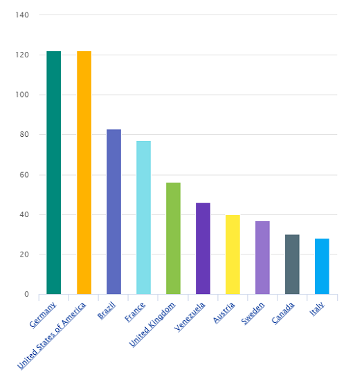
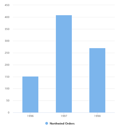
Column Charts are like Bar Charts but use vertical bars whose heights represent each value.
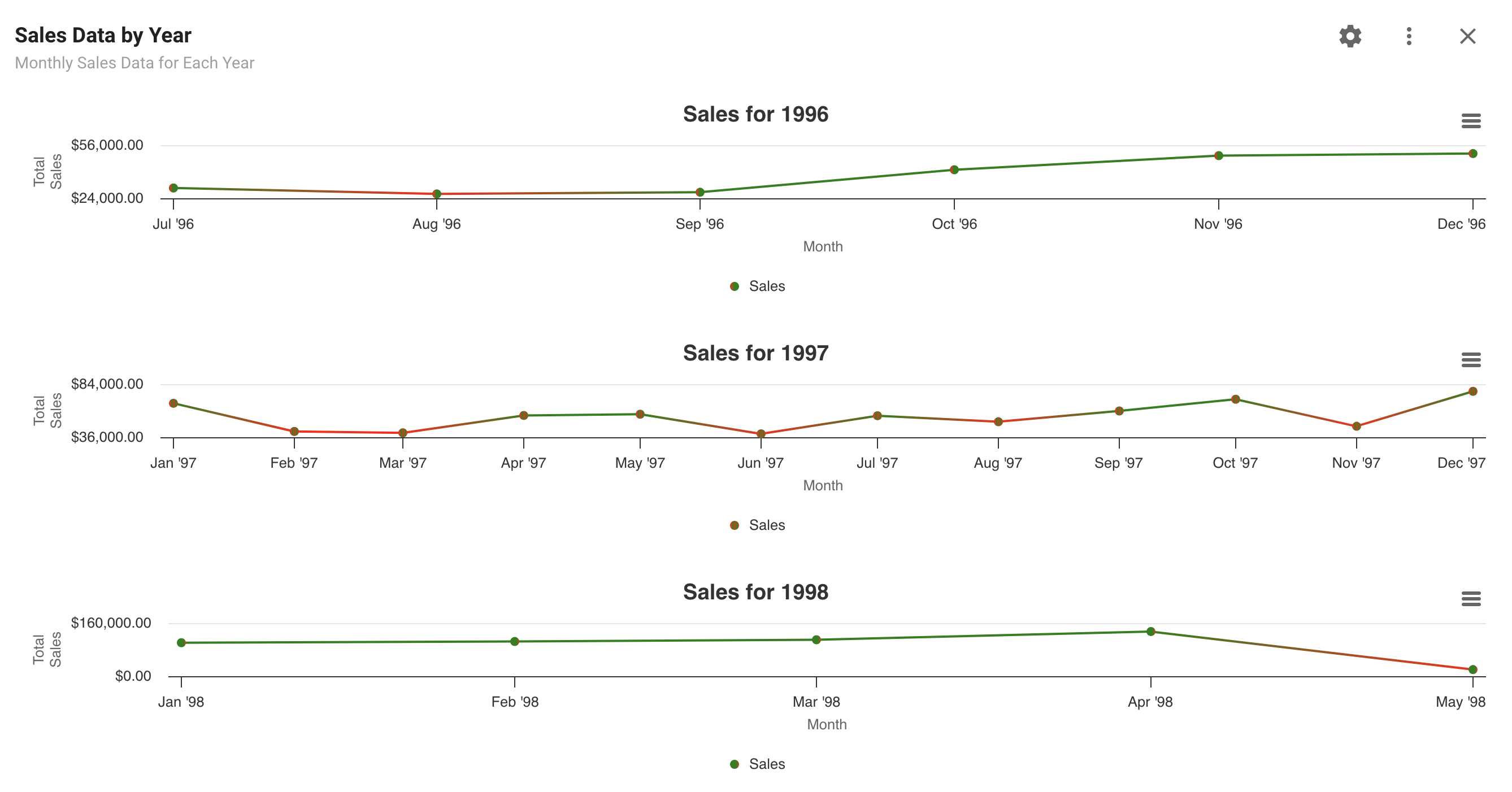
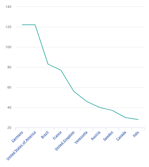
Line Charts display data points connected by straight lines.
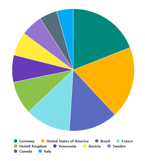
Pie Charts display circles divided into slices that indicate values by the size of each slice.
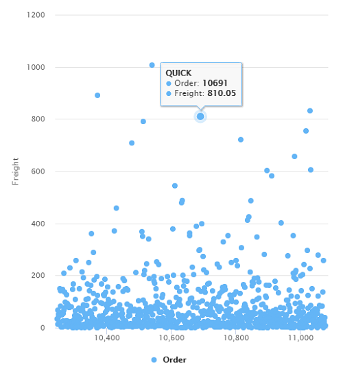
Scatter Plots display individual data points.
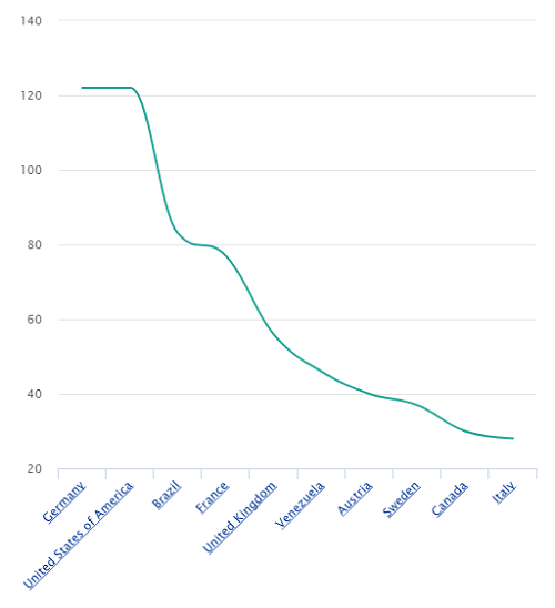
Spline Charts are line charts that use curved lines between data points, giving a more natural approximation of interpolated values.
Trend Charts display how data changes over time. Trend Charts can use Line, Spline, Area, Area Spline, Bar, and Column Charts.
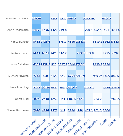
Heat Maps are graphical representations of data where the individual values in a matrix are represented as colors.
Spider Charts are a two-dimensional representation of multivariate data on axes starting from the same point. They are a circular graph used as a comparative tool.
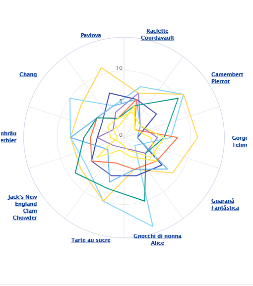
Spider Charts use a circular layout similar to Polar Charts, but they serve different purposes. A Spider Chart is best for comparing multiple categories or metrics for one or more items, where each axis represents a different variable (for example, comparing product features or performance metrics). A Polar Chart is typically used when the angle around the circle represents a meaningful order or direction, such as time cycles or compass directions. In most cases, Spider Charts are preferred when comparing several metrics side by side, while Polar Charts are better suited for directional or cyclical data.
KPIs
Big Number displays a single number to represent a user-defined value, such as an aggregate value of a Field.
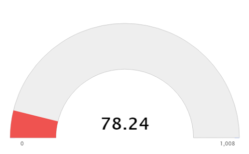
Gauges are similar to Big Numbers but display a gauge indicating what percentage the value makes up of a total value.
Maps
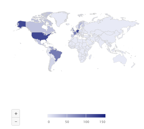
Maps display data from a result set associated with a location and overlay that data onto a map.
Tables
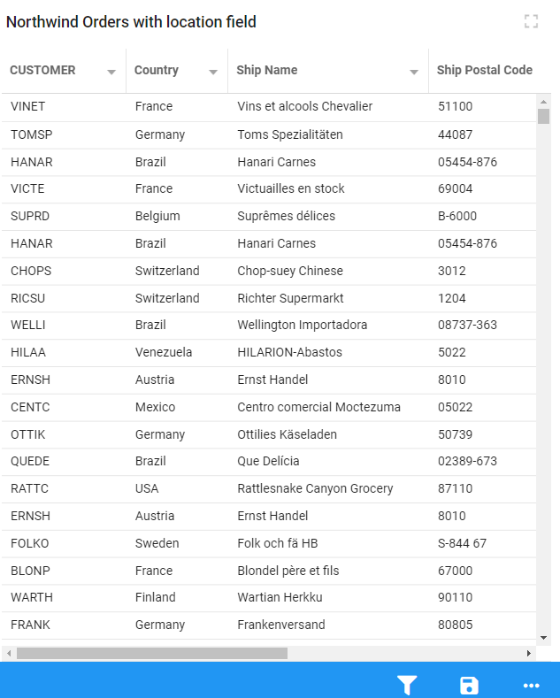
Data Grids display information in a row-and-column format.
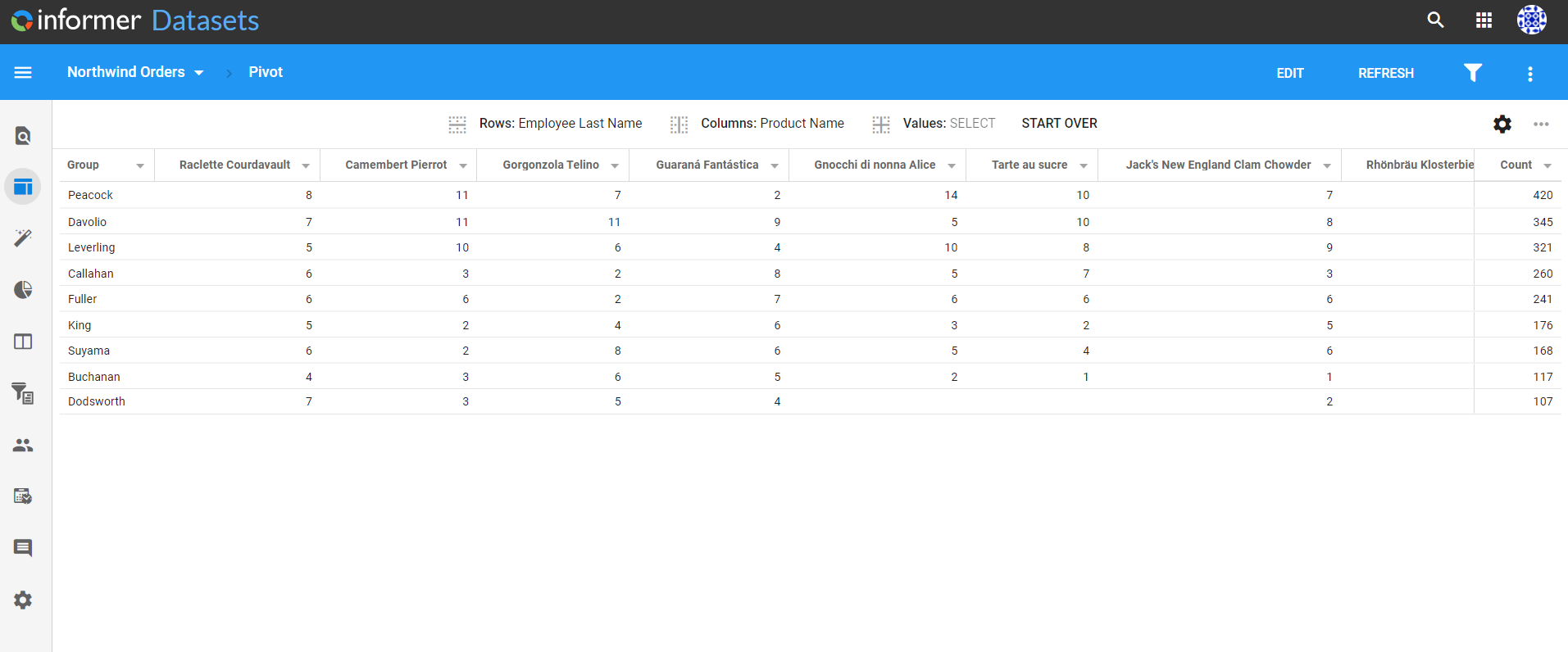
Pivot Tables summarize data by organizing information into related groups based on sums, averages, or other statistics.
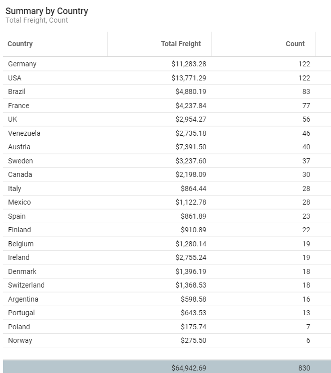
Summary Tables show aggregate data based on groups.
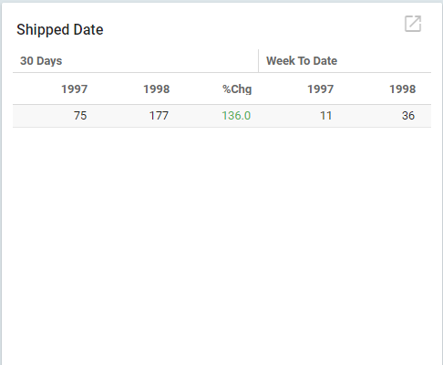
Trend Tables show a change in data over time with color-coded percentages.
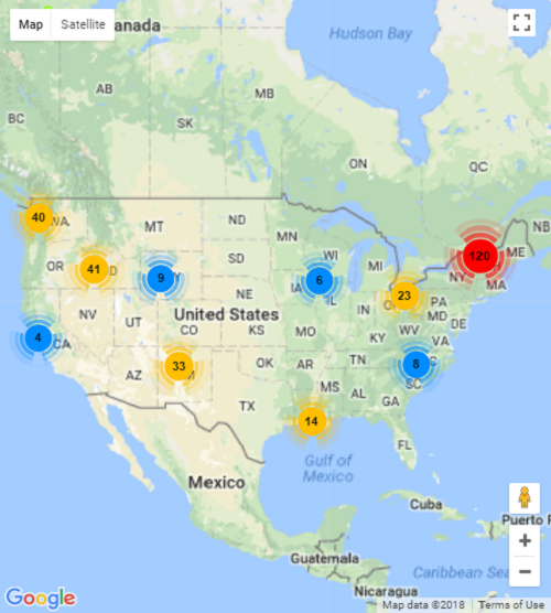
Google
Google Maps display a map produced by Google overlaid with circles of data. Users can zoom in and out to obtain individual or group detail. This requires a Google Maps API key.
Static
HTML displays a static Visual built with HTML code.

Magic Visual
Magic Visual lets you create visual representations of your data with minimal effort. It is useful for quickly generating Visuals without complex configuration, and it can create any type of chart using AI. See Magic Visual for more information.