Magic Visual
The Magic Visual feature is a dynamic tool that helps you create visual representations of your data with minimal effort. It is particularly useful when you need to quickly generate Visuals without working through complex configurations.
To use the Magic Visual feature, AI must be enabled in the Administration AI settings.
Creating a Magic Visual
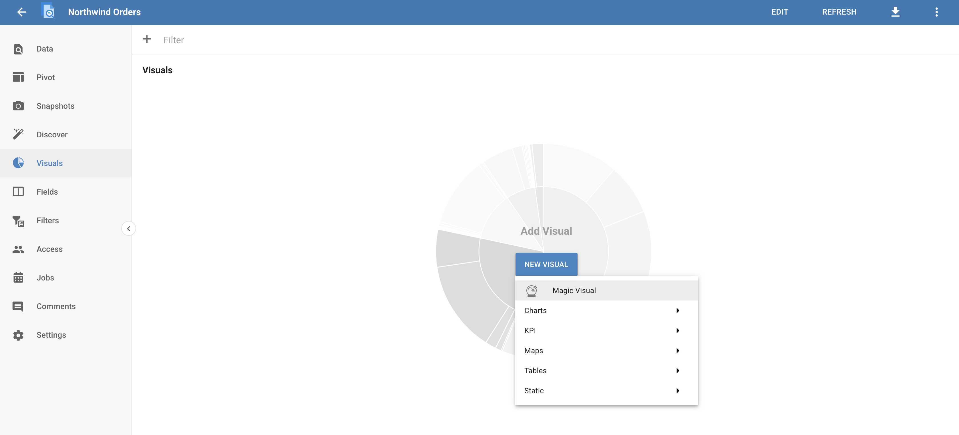
To create a Magic Visual, navigate to the Dataset's Visuals page and select Magic Visual from the New Visual dropdown.
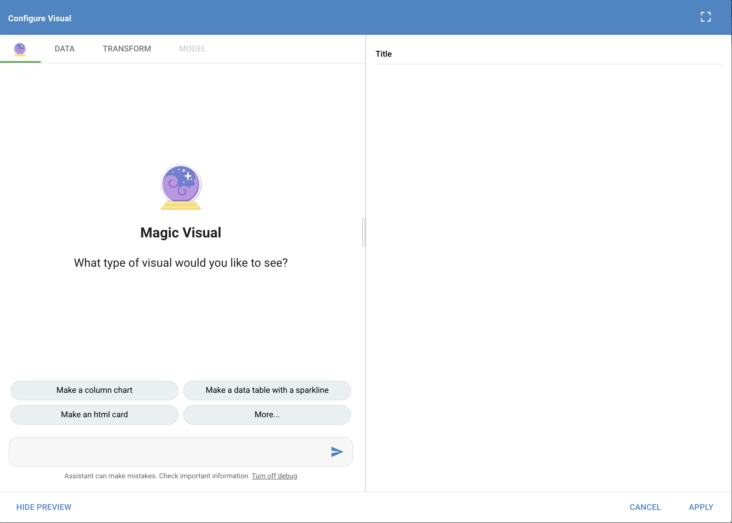
Selecting this option opens the Magic Visual dialog. Here you can use one of the generated prompts to start a Magic Visual, or instruct the AI to create a Visual of your choosing.
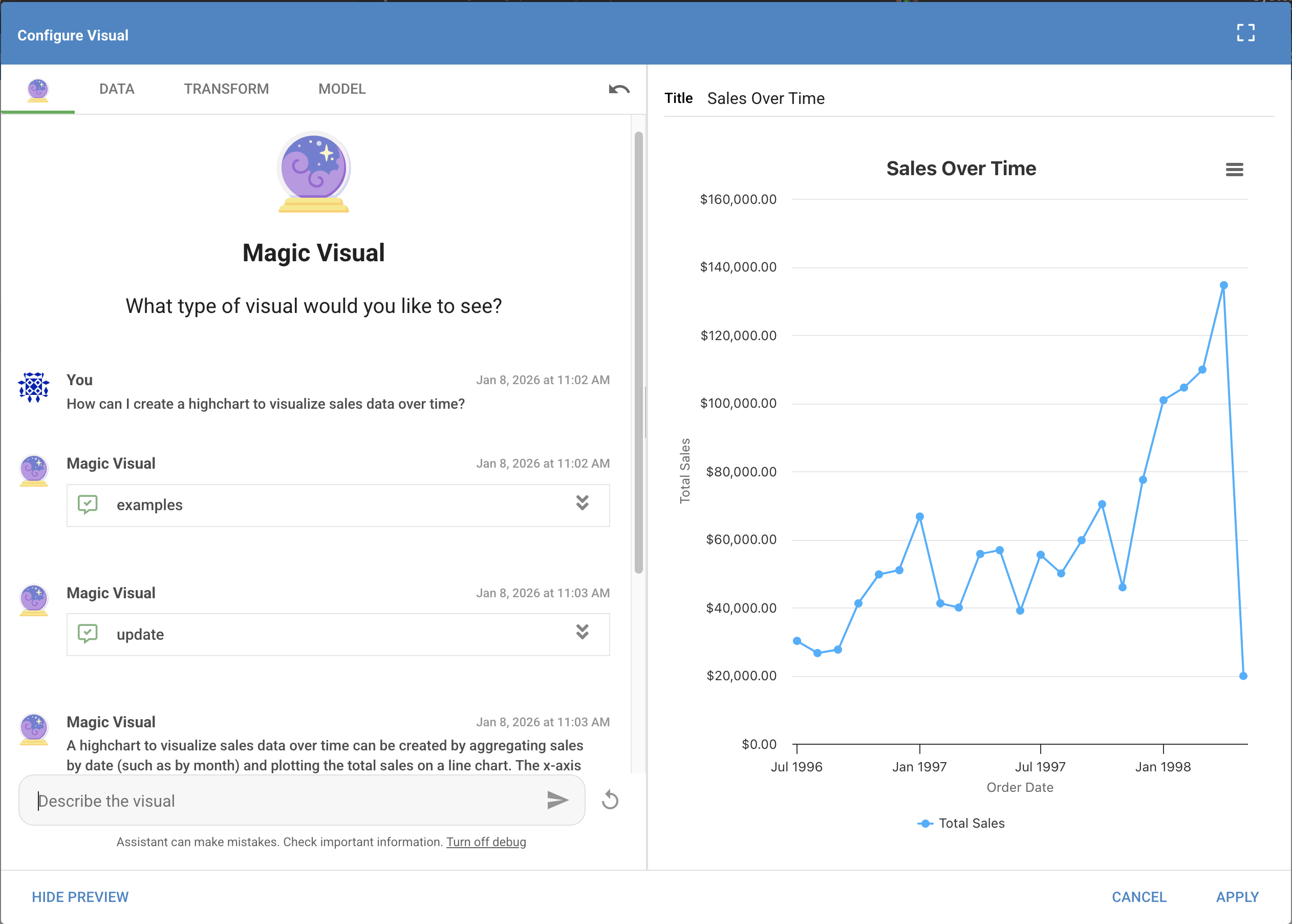
For example, you could ask the Magic Visual to create a chart that analyzes sales data over time.
Customizing your Magic Visual
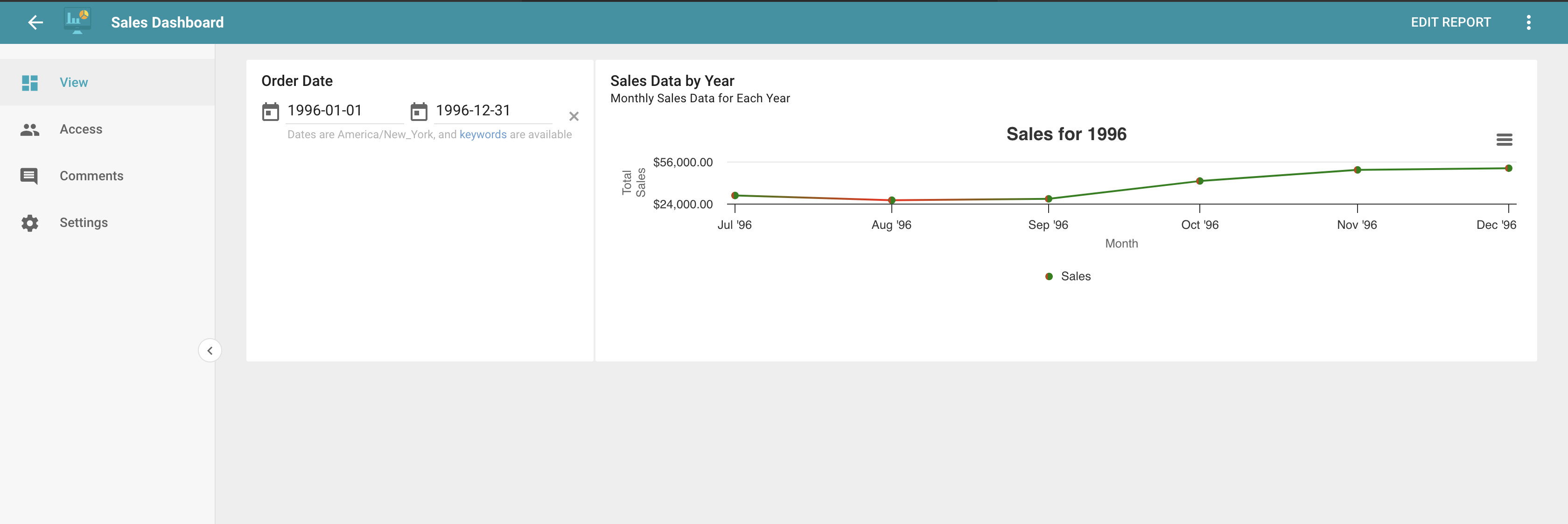
Once your Magic Visual is created, you can continuously refine it. For example, you could ask the AI to split the original Magic Visual into three charts, one for each year, then ask it to use green lines when sales increase and red when they decrease.
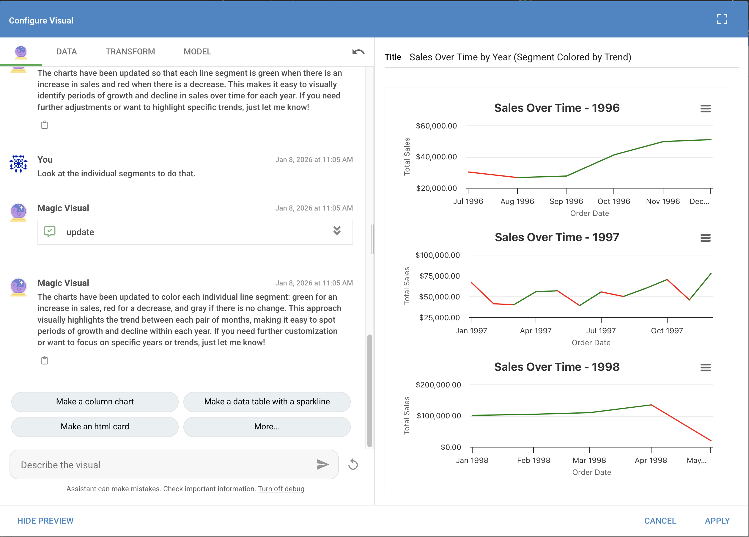
Magic Visual: Data tab
Use the Data tab to view the underlying Elasticsearch query generated by the AI. If you are familiar with Elasticsearch, you can edit the query and see the changes reflected in the Magic Visual.
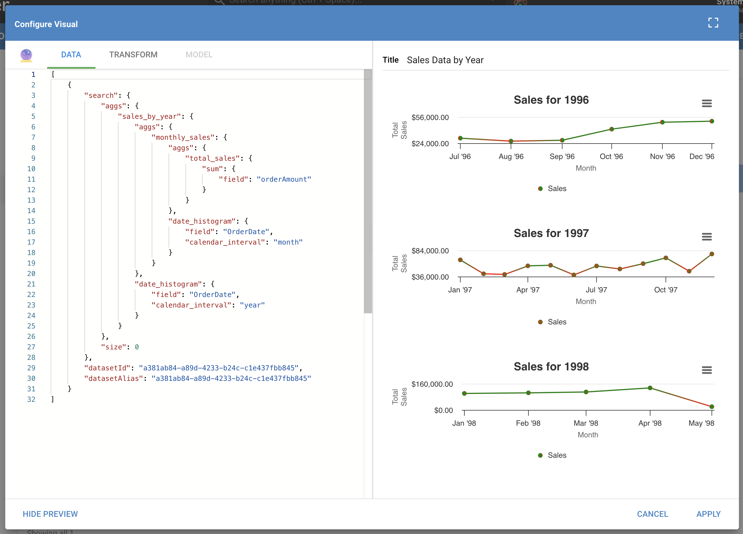
For example, changing the following:
"date_histogram": {
     "field": "OrderDate",
     "calendar_interval": "month"
}
to this:
"date_histogram": {
     "field": "OrderDate",
     "calendar_interval": "quarter"
}
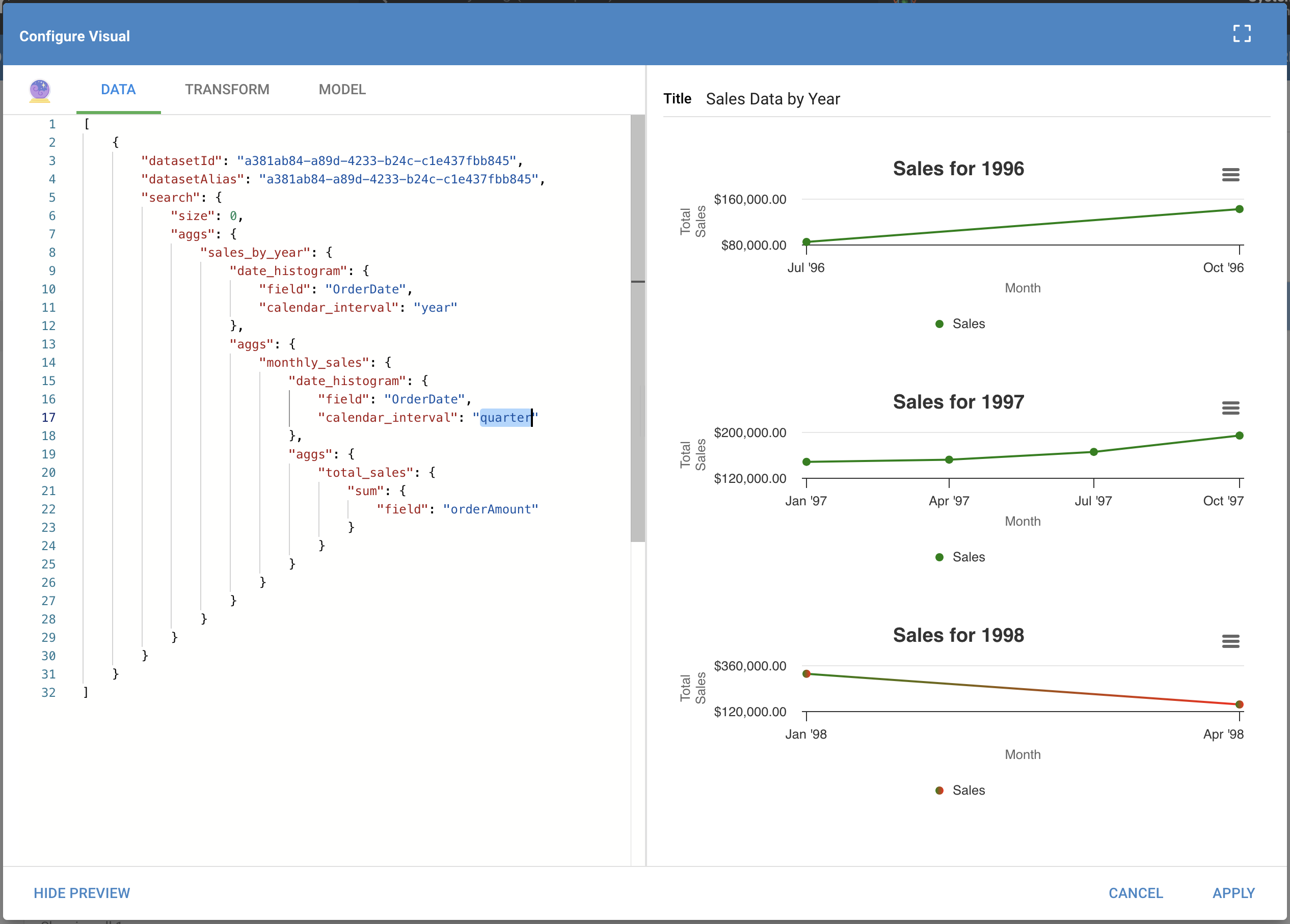
shows the sales data by quarter instead of by month. In the resulting Magic Visual, there are no longer data points for each month; instead there are up to four data points, one for each quarter.
Magic Visual: Transform tab
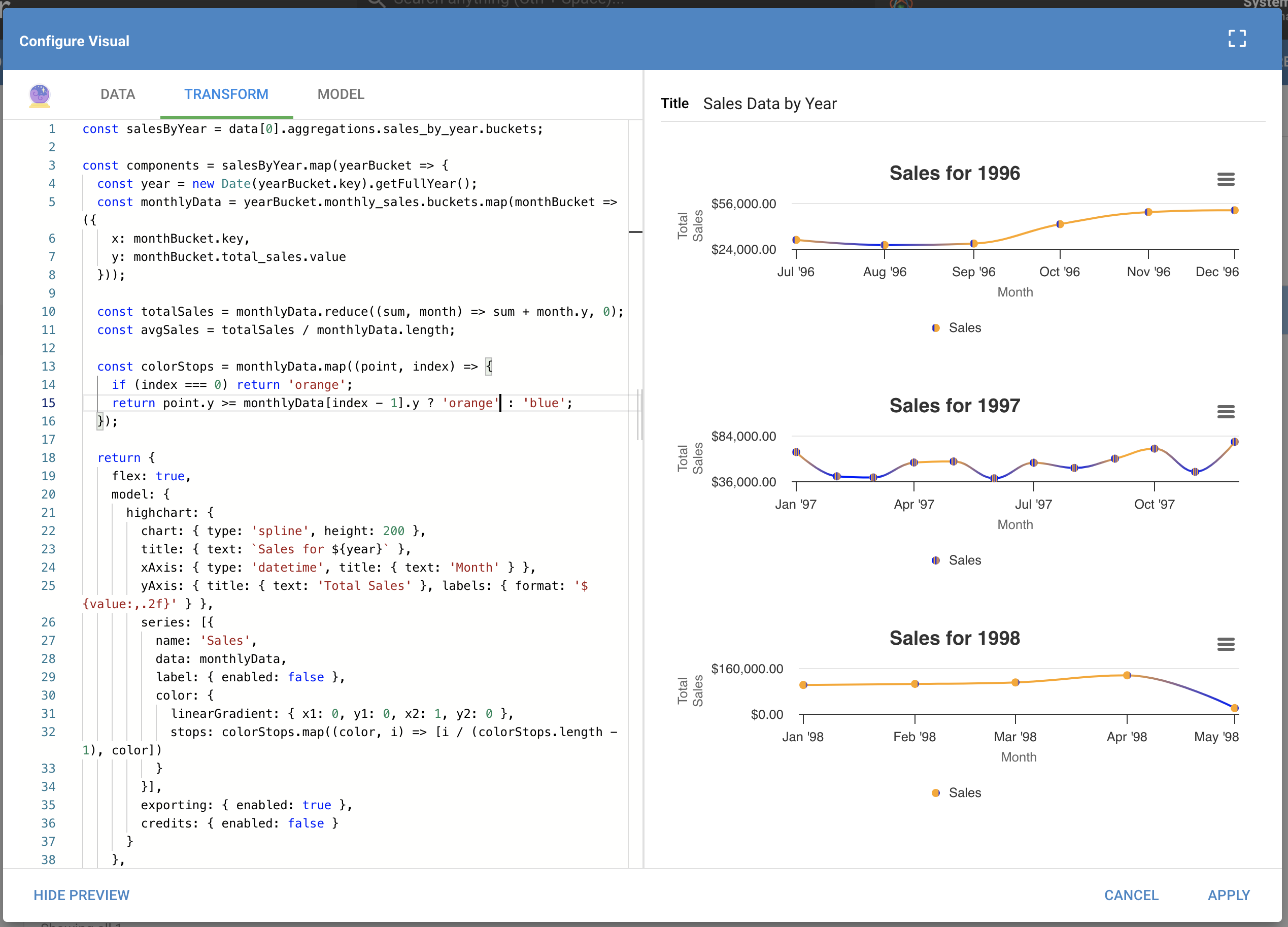
Use the Transform tab to view the code that transforms the results of the Data tab's Elasticsearch query into a usable form for the Magic Visual. You can alter the code and see the changes reflected in the Magic Visual.
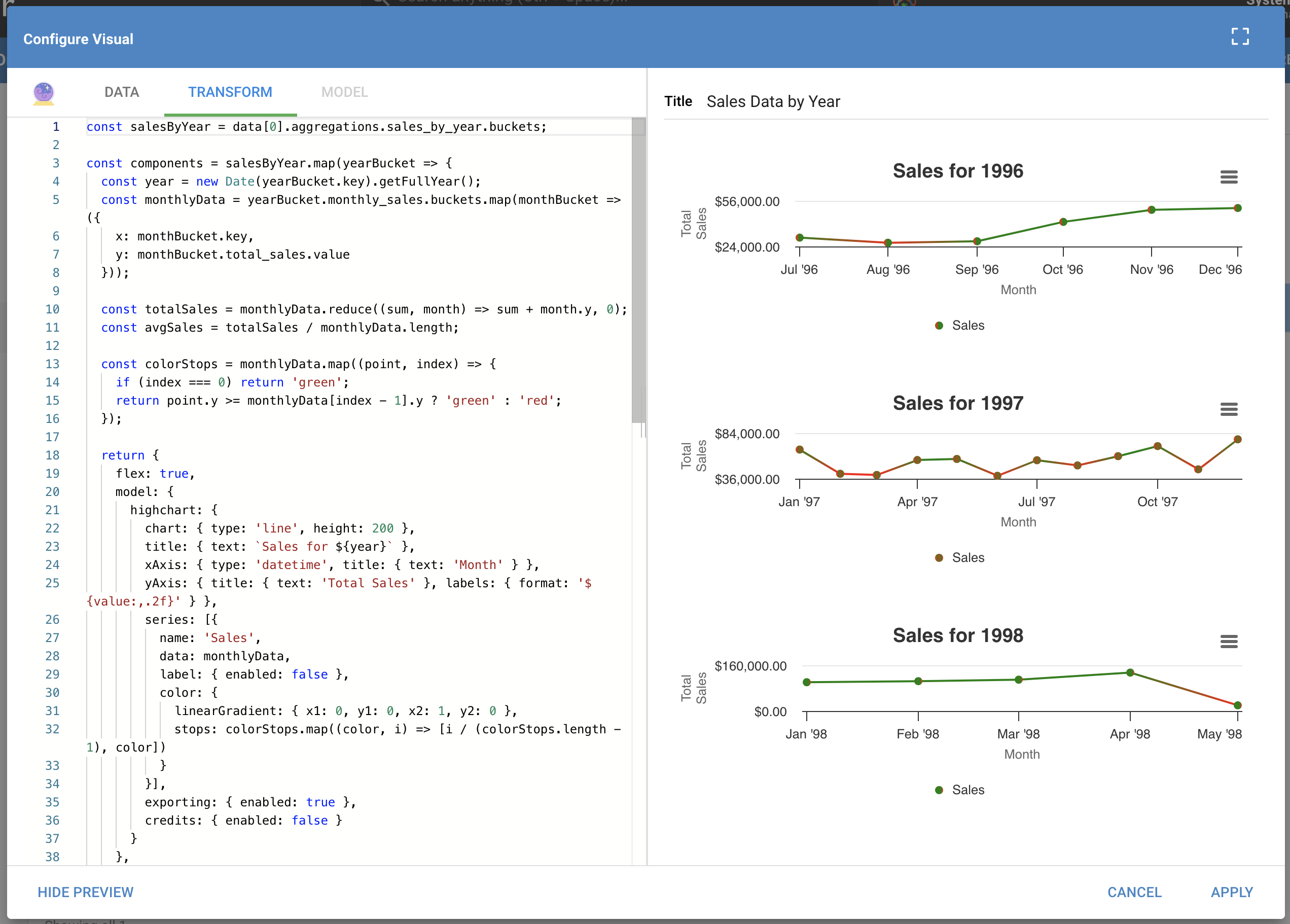
For example, changing the colors on lines 14 and 15 and the chart type on line 22:
14      if (index === 0) return 'green';
15      return point.y >= monthlyData[index - 1].y ? 'green' : 'red';
...
22      chart: { type: 'line', height: 200 }
to this:
14      if (index === 0) return 'orange';
15      return point.y >= monthlyData[index - 1].y ? 'orange' : 'blue';
...
22      chart: { type: 'spline', height: 200 }
changes both the Magic Visual's chart type and colors.
Magic Visual: Model tab
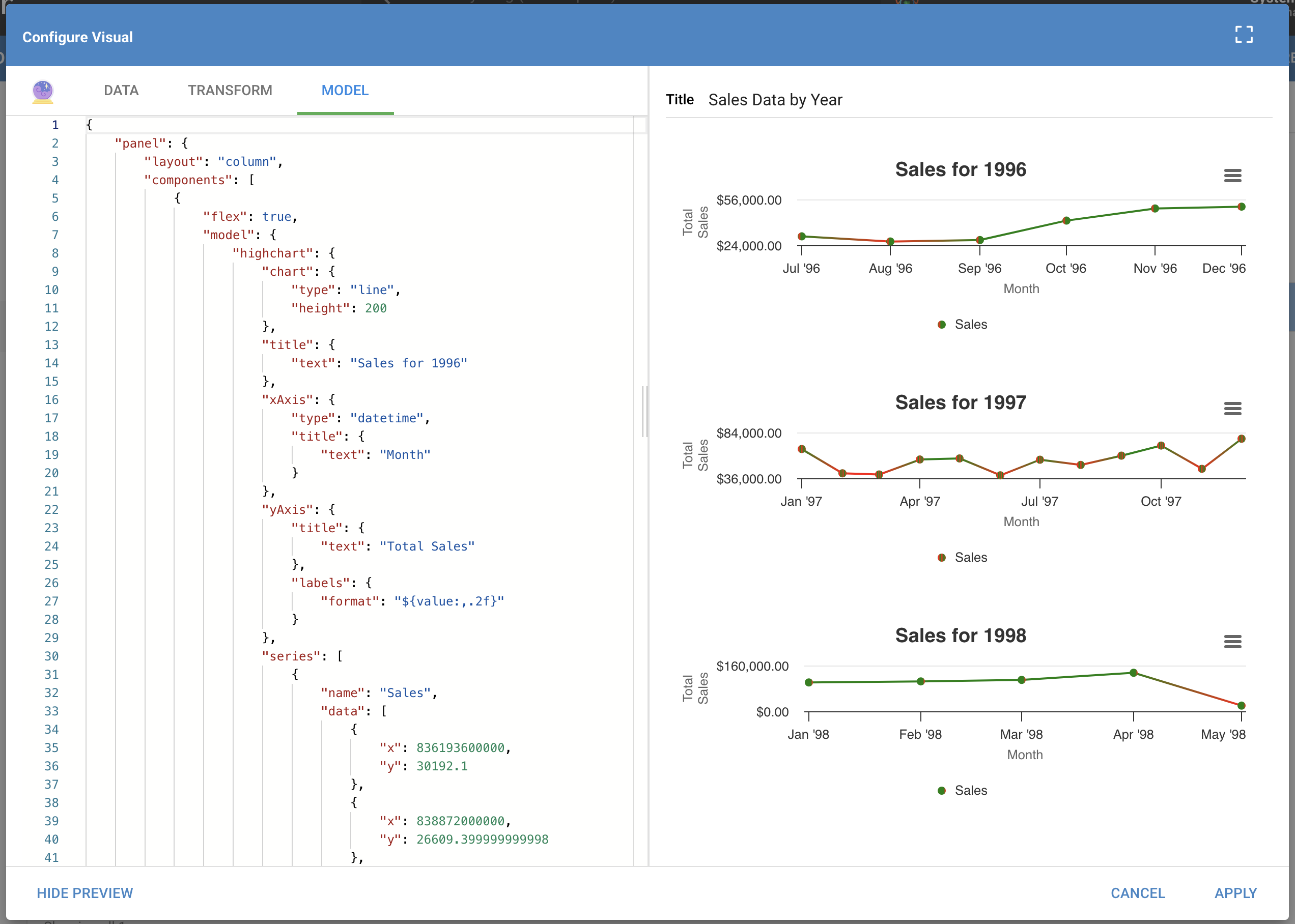
Use the Model tab to view a sample output of the Magic Visual's model. The code on the Model tab should not be edited; use it only for debugging.
Interacting with Magic Visuals
When you are satisfied with your Magic Visual, click Apply to save it to the Dataset's Visuals list. Once saved, you can interact with it the same way as any other Visual: filter it, add it to the Homepage, or add it to a Dashboard.