Types of Inputs
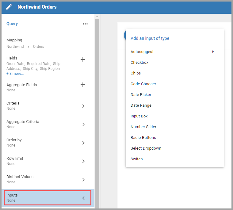
An Input lets Users specify what data to pull at run time. There are several types, some better suited to specific data types.
Autosuggest
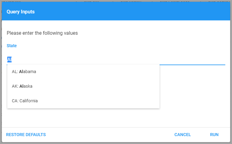
Autosuggest Inputs give the user a list of unique Field values that match the characters they enter.
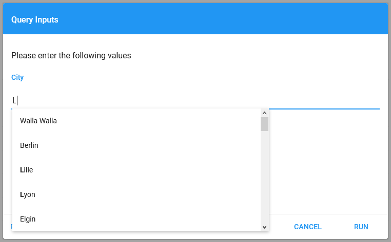
If there are many unique results, or Informer has to query a particularly large table, the dropdown may take a moment to populate.
There are two Autosuggest options. Autosuggest returns a raw Field value used in the Query as Criteria, plus a descriptive label. This is helpful because Users can search using the label rather than the Field value they might not be familiar with. Both the value and label Fields need to be in the same Mapping, like a validation table.
If using multiple selections for the Input's value, make sure the place the values go in the Query string can support single and multiple values.
The Distinct values from data type returns all unique values of a Field. Informer queries the designated Field and returns unique values that match what the User types. These options allow multiple values, single values, or checkbox values.
Checkbox
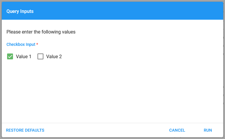
Checkbox Inputs let the user select whether a value is true (checked), false (unchecked), or empty (optional). The value displayed is not the value used in the criteria; this Input only returns true or false depending on the box.
Chips
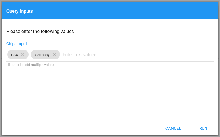
The Chips Input is a freeform text box where Users enter any values. Press Enter after each term to add a chip that distinguishes it from other terms.
Code Chooser
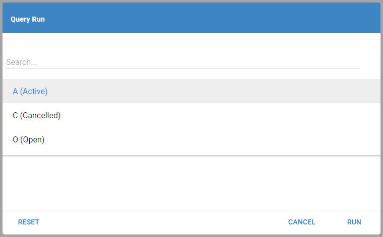
The Code Chooser Input lets Users apply User Codes. Users can add Codes to Dataset Filters or add a code value to a Template.
Date Picker
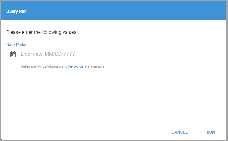
The Date Picker Input lets Users enter a date in the text box or select one from a calendar. Click the calendar icon to the left of the text box to open the calendar.
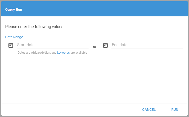
Date Range
The Date Range Input lets Users enter a range of dates or select them from calendars. Click the calendar icons to the left of the boxes to open the calendars.
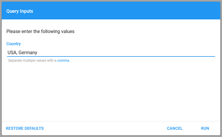
Input Box
The Input Box is a freeform text box like the Chips Input. Instead of pressing Enter after each term, Users specify a character to separate terms (set when creating the Input). This is useful when pasting multiple delimited values from an outside source, such as student IDs.
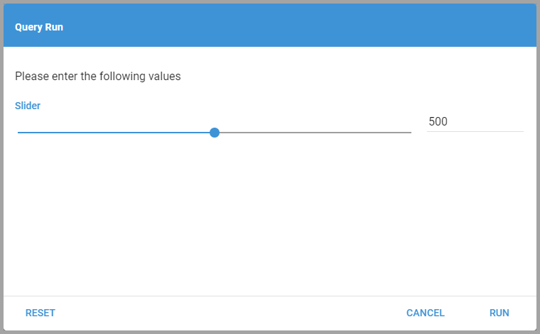
Number Slider
Number Sliders let Users choose a value between a minimum and a maximum. Drag the dot to change the value, or type a value into the text box to the right.
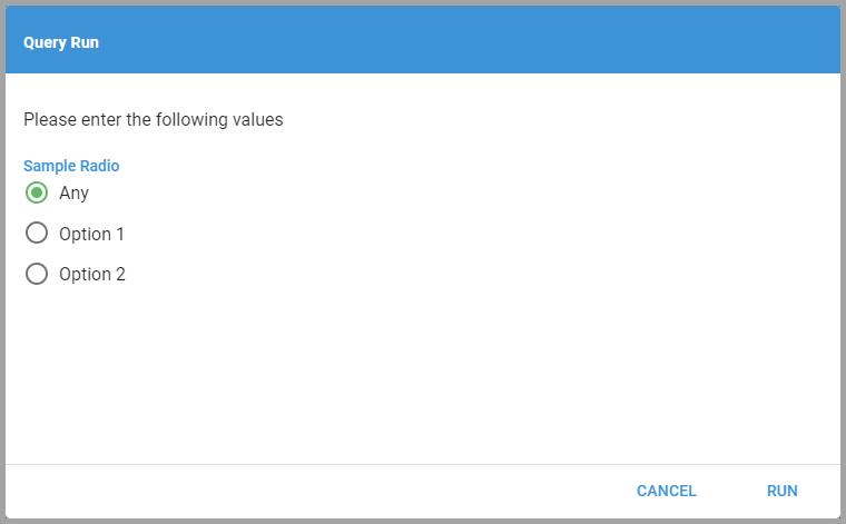
Radio Buttons
Radio Buttons let Users select a single value from a set of options.
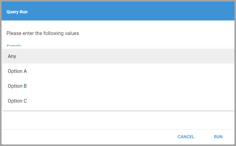
Select Dropdown
Select Dropdowns let Users select a value from a dropdown list.
Switch
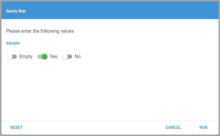
Switch Inputs are like Checkbox Inputs: they give the User a Boolean choice, but are generally used to toggle settings, such as whether a certain Field value exists.