Adding an Input
Configuring an Input lets Users specify what data they want at run time. Informer takes the value and uses it in the Query's Criteria or Flow Steps.
Adding an Input
Add Inputs from the Query's Edit page. Select Inputs in the left panel to open the list of Inputs, then click the + icon to choose a type.
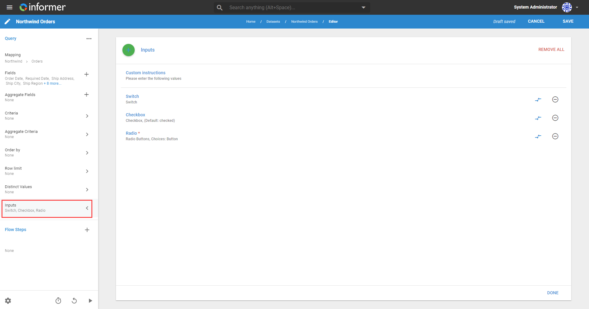
Fill out the form with the required information. See Types of Inputs for descriptions of each type. These options are available for all Input types:
- Label: the name of the Input in the prompt to the User (required).
- Alias: auto-generated from the Label, and editable. The Query uses the alias to reference the Input's value in calculated Fields or power-script Flow Steps (required).
- Tooltip help: descriptive pop-up text the User can click when presented with the Input (optional).
- Require Value: the user must enter a value when prompted (optional).
- Default Value: the value used if the Input is blank when running or refreshing the Query. It also generates the live sample while editing (optional).
Click Apply to add the Input.
Input-specific options
Other options are available depending on the Input type.
Autosuggest
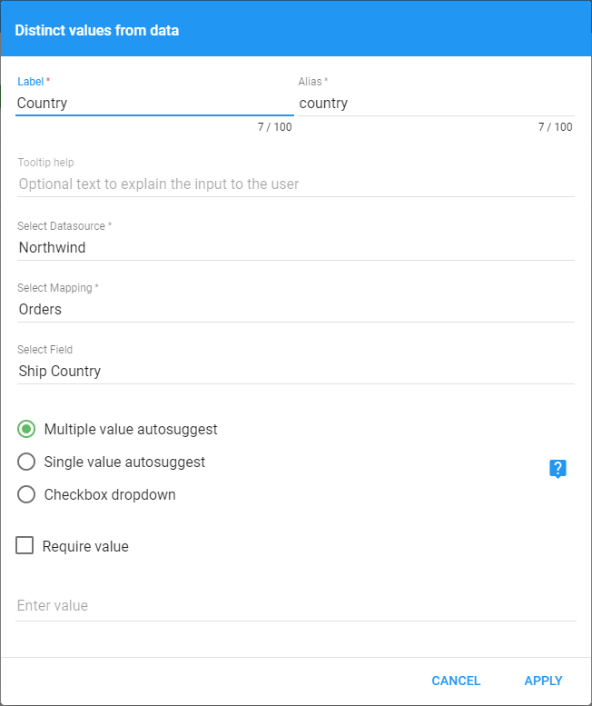
- Select Datasource, Mapping, and Field: the Autosuggest Input returns live, unique results for a specific database Field. These options choose which Field the suggested values come from (required).
- Multiple value, Single value, and Checkbox dropdown: let the User type more than one value, limit them to a single value, or dynamically populate a list of checkbox options.
Checkbox
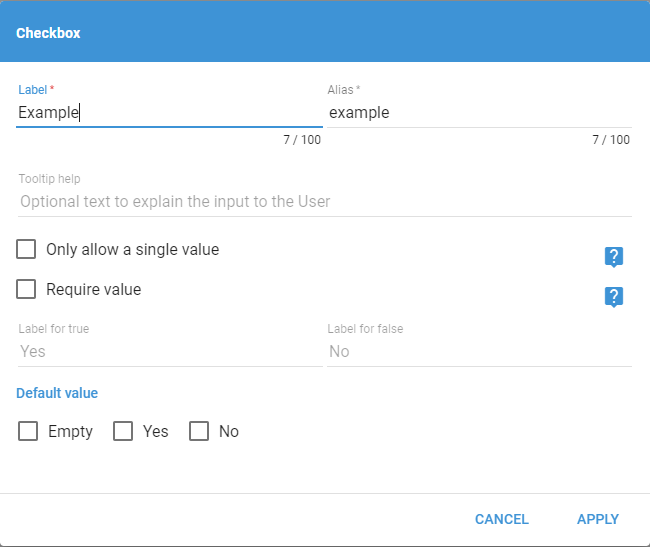
- Only allow a single value: prevents Users from sending true and false or neither, so an unchecked box sends false and a checked box sends true.
- Required value: the same as on other Inputs, except that requiring a value disables the Empty option.
- Label for true / false: changes the labels Users see when entering the Input.
Chips
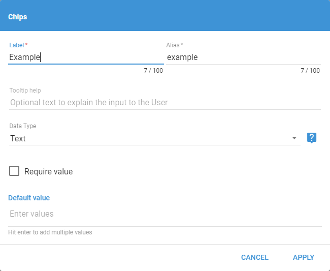
Data Type is the only extra option. It changes whether Users enter text, a number, or a date. Using a number or date validates the format and converts the value to that type.
Date Picker and Date Range
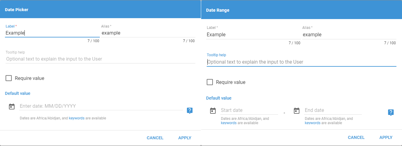
The Date Picker and Date Range Inputs use the default Input options. They need a default to produce a usable live sample if the Query author requires them.
Input Box
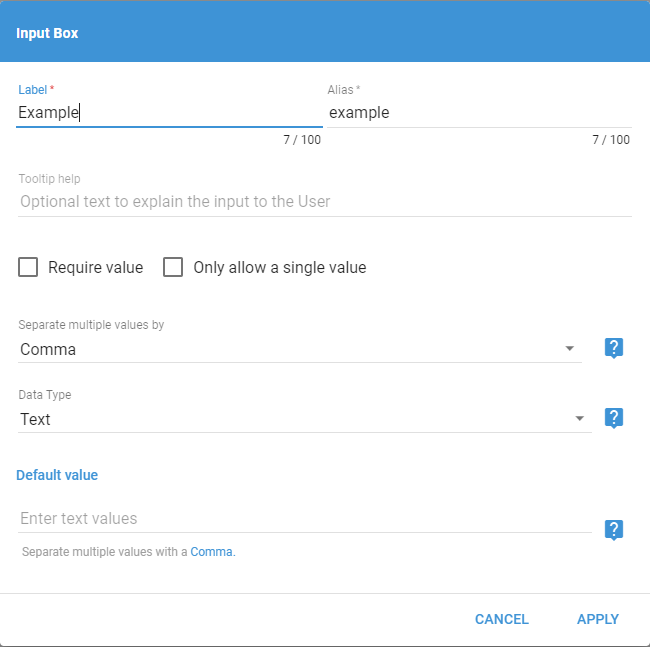
- Only allow a single value: prevents Users from adding extra values.
- Separate multiple values by: sets the character Users use to add multiple values. The options are Comma (
,), Colon (:), Line (|), and Semicolon (;). Users can change the delimiter at run time, but this is the default. - Data Type: changes whether the Query reads the Input as text, a number, or a date. The Query converts numbers and dates from the text.
Number Slider
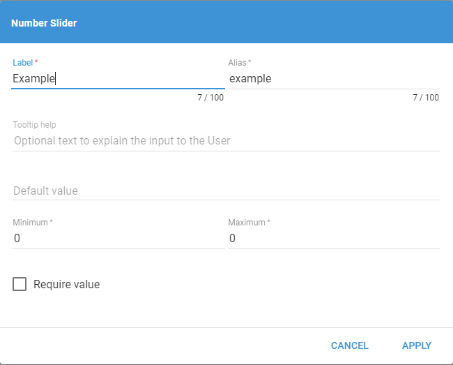
Minimum and Maximum are the only extra options. They set the range of the slider.
Radio Button
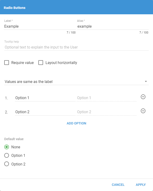
- Require value: functions the same as other Inputs. Requiring a value disables the None option.
- Layout horizontally: lays the options out in a row instead of a column.
- Values are...: sets the data type of the options. The default is "Values are the same as labels," with options for numbers, text, and dates.
- Options: set the label or value for each option. Add options with Add Option, remove them with the - to the right of the value.
Select Dropdown
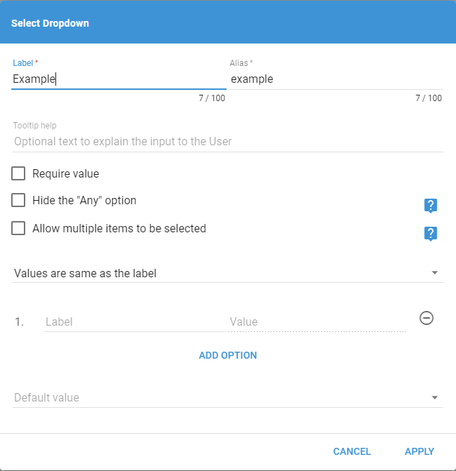
- Hide the "Any" option: select this if a default value is necessary. There is no way to provide null without the Any option.
- Allow multiple items to be selected: sets the values as an array of choices instead of a single option.
- Values are...: sets the data type of the options, the same as for Radio Buttons.
- Options: set the label or value for each option, the same as for Radio Buttons.
Switch
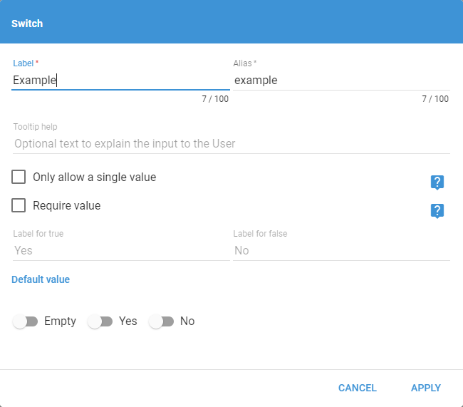
- Only allow a single value: prevents Users from sending true and false or neither.
- Required value: the same as other Inputs, except that requiring a value disables the Empty option.
- Label for true / false: changes the labels Users see when entering the Input.