Creating a Dashboard
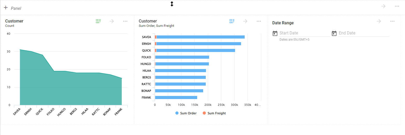
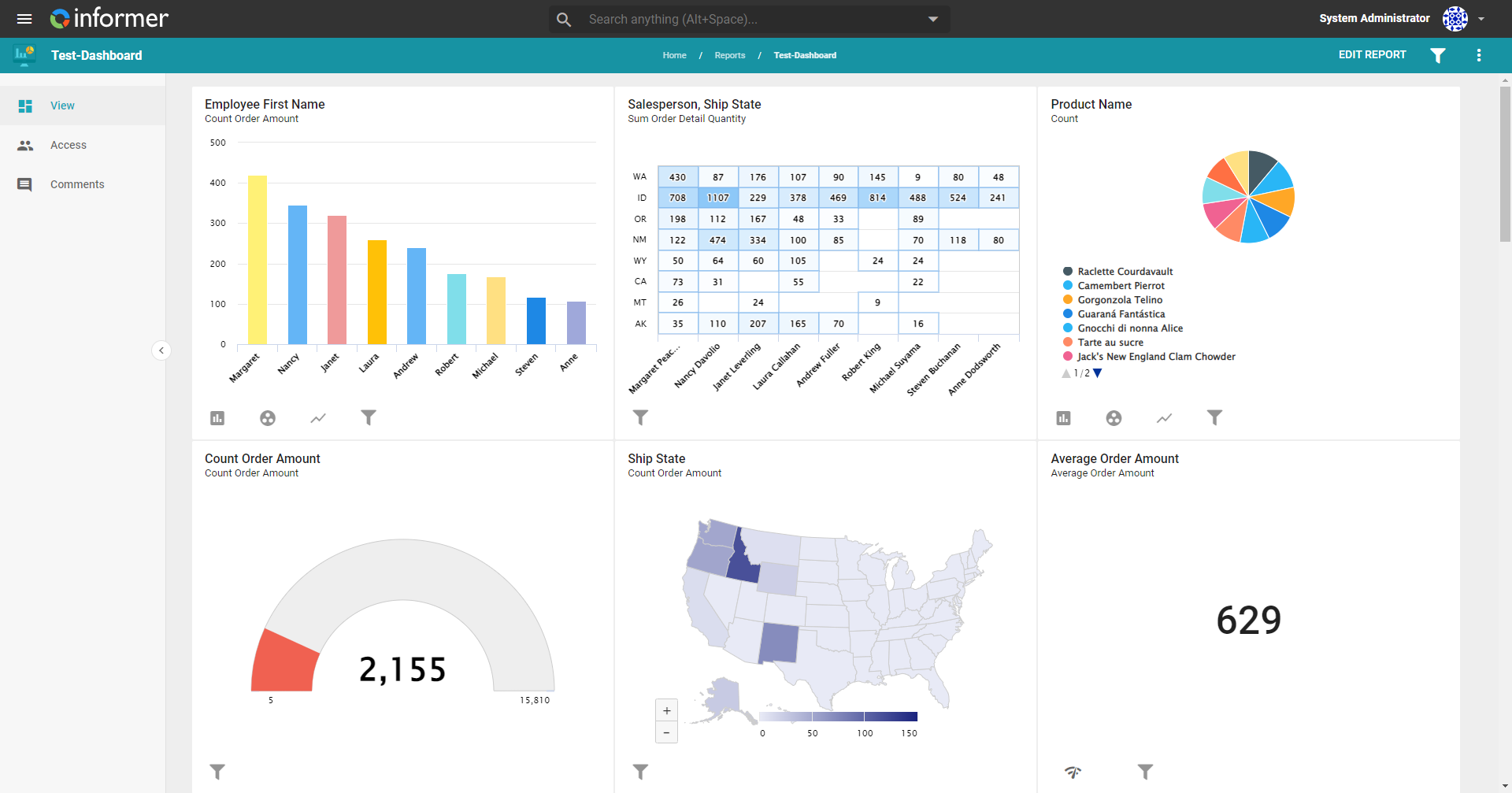
A Dashboard collects Visuals of a similar concern that provide interactive metrics measured against Key Performance Indicators. Creators customize Dashboards in the editor by dragging, dropping, resizing, and rearranging Visuals to create the desired layout.
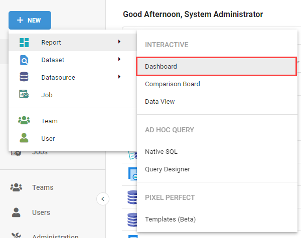
To create a Dashboard, click the + New button in the upper-left of Informer, hover over Reports, and select Dashboard under the Interactive heading.
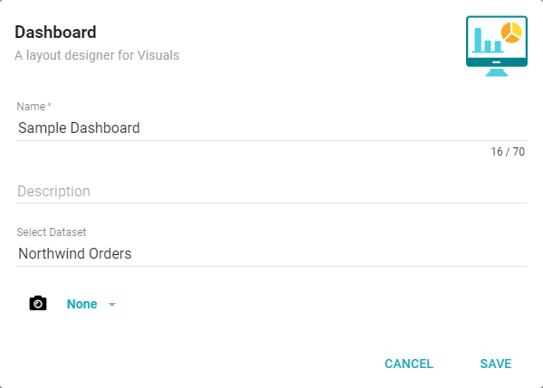
A dialog opens. Enter a name and optional description, select a Dataset or a Snapshot of a Dataset to build the Dashboard from, then click Save.
Dashboard Editor
After clicking Save, Informer creates an empty Dashboard ready to be edited. You customize the layout and Visuals from this editor.
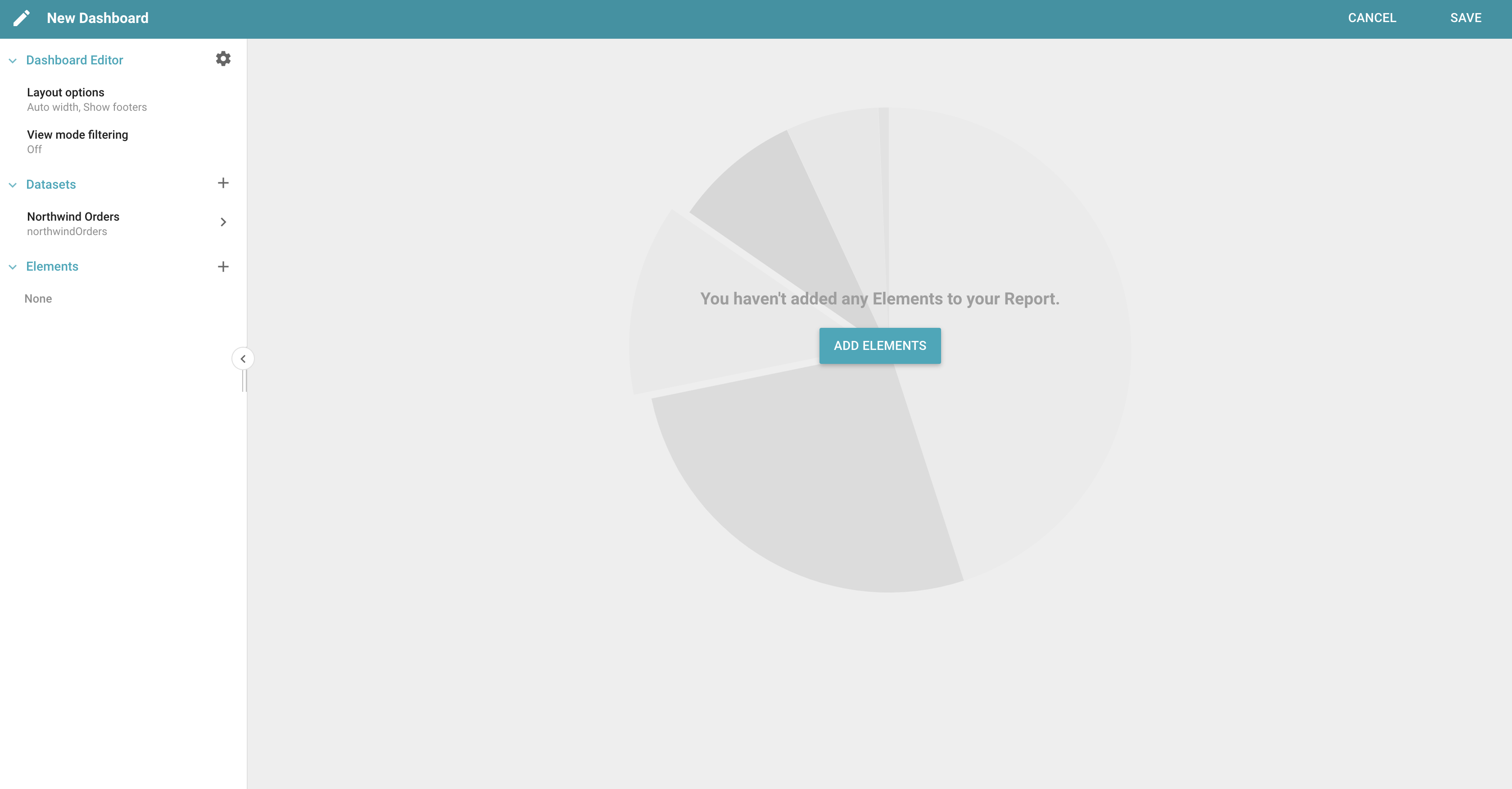
Click the cog button next to Dashboard Editor to view additional options.
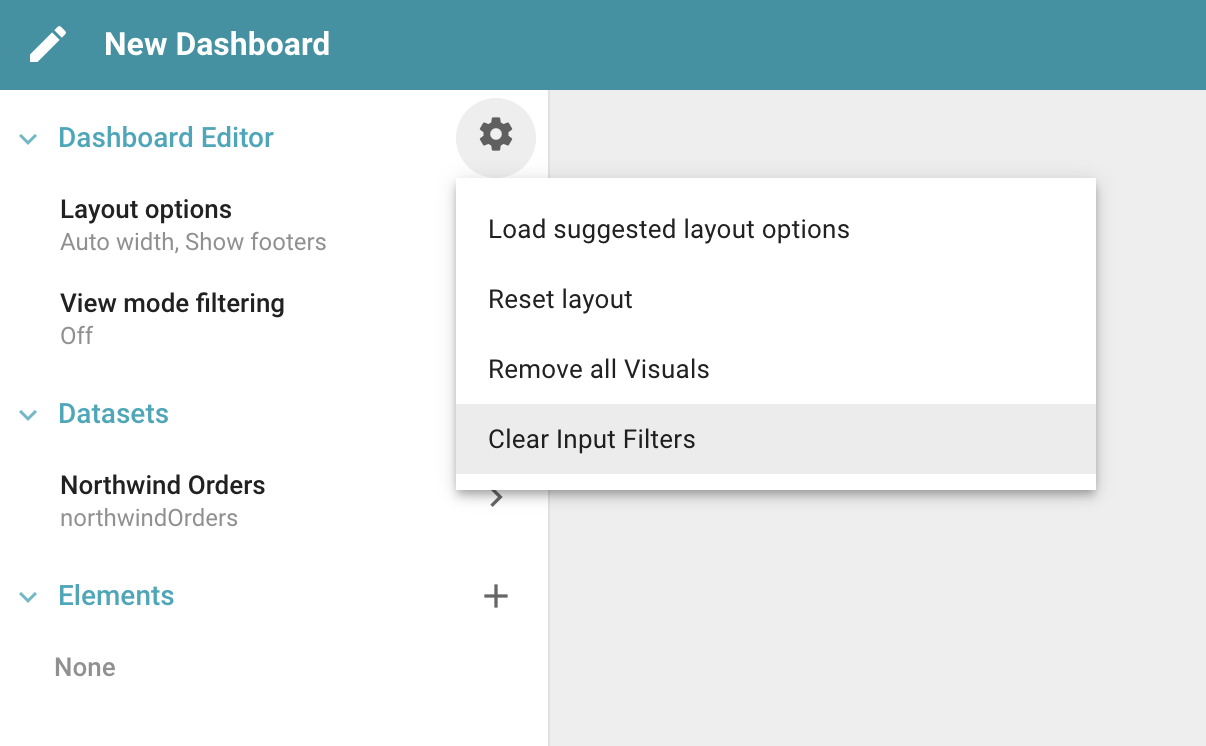
- Load suggested layout options: sets the Dashboard's layout options to the default.
- Reset layout: sets the Dashboard's layout to the default.
- Remove all Visuals: removes all Visuals from the Dashboard.
- Clear Input Filters: clears the inputs for all Dashboard Input Filters.
Layout Options
A Dashboard's layout can be edited by clicking Layout Options, which sets the minimums and maximums of the Dashboard's width and margins, as well as Slices.
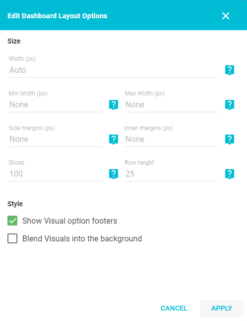
- Width: the Dashboard's width in pixels. If blank, the width stretches automatically to the size of the page.
- Min / Max Width: the minimum or maximum allowable width. If the width is set to auto, the Dashboard shrinks or stretches up to the given size. There is no minimum or maximum by default.
- Side Margins: the space to the left and right of the outer Dashboard, from 0 to 200 pixels.
- Inner Margins: the space between each Visual, from 0 to 20 pixels.
- Slices: the snap-to points Visuals have available for resizing horizontally. The larger the number, the more finely a Visual can be resized. Larger screens allow more Slices. This value ranges from 24 to 200, with 100 as the default.
- Row Height: the granularity of each size step when resizing Visuals vertically. The smaller the number, the more finely a Visual can be resized. The default is 25 pixels.
- Style: styling options available when viewing a Dashboard.
- Show Visual option footers: toggles the option footers at the bottom of each Visual. Useful for creators who do not want viewers to Filter, Split, or affect the Visuals.
- Blend Visuals into the background: removes the borders from Visuals, blending them into the Dashboard's background.
After hiding the Visual options, configure Visuals by clicking the Actions menu in the top-right corner of the Visual and selecting Configure.
View mode filtering
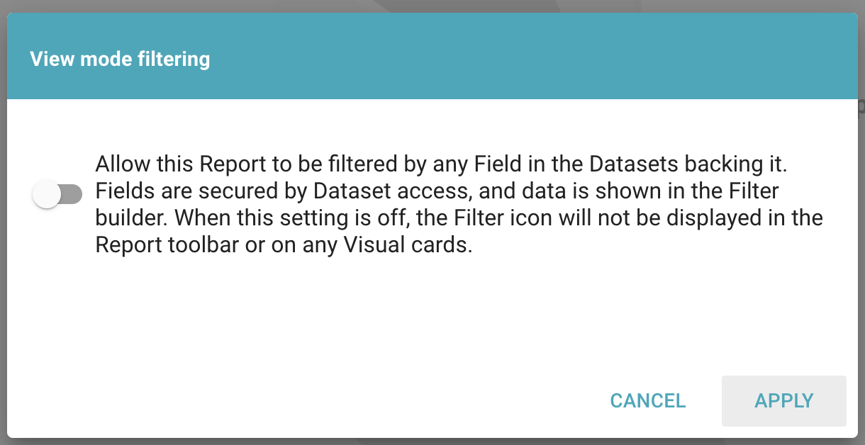
View mode filtering controls whether the Dashboard can be filtered in view mode. Even when it is disabled, Users can still filter Datasets and Visuals while editing. You can also change this setting on the Dashboard Settings page.
Datasets
Any Datasets added to the Dashboard can be used to build Visuals. The Datasets menu on the left of the editor lists all of the Datasets that are part of the Dashboard. Click the + button to add a new Dataset or Snapshot. Snapshots are chosen by clicking the camera icon after selecting the underlying Dataset.
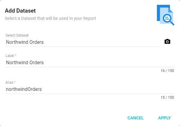
Opening any Dataset from the Dashboard editor lets you view or Filter the Dataset. Filtering a Dataset this way applies the Filter to all Visuals on the Dashboard created from that Dataset.
Elements
Use the Add Elements menu to add new Visuals to the Dashboard, or click the + button next to Elements on the left menu.
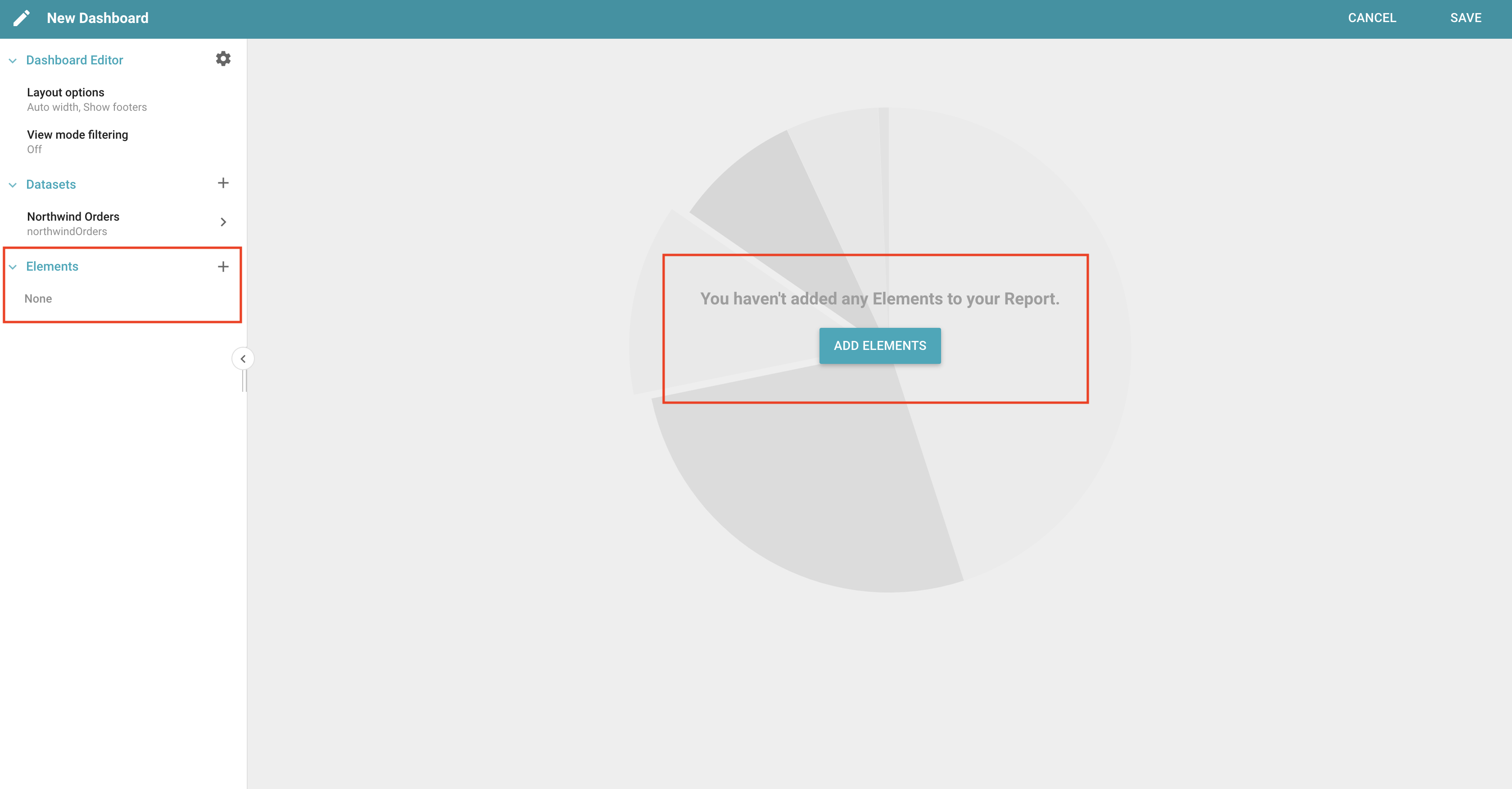
The options are Discover, Saved Visuals, and creating a new Visual. Visuals can be rearranged and resized: move a Visual by clicking next to the title and dragging it, and resize it by dragging an edge for length or width, or the bottom-right corner for both.
Discover
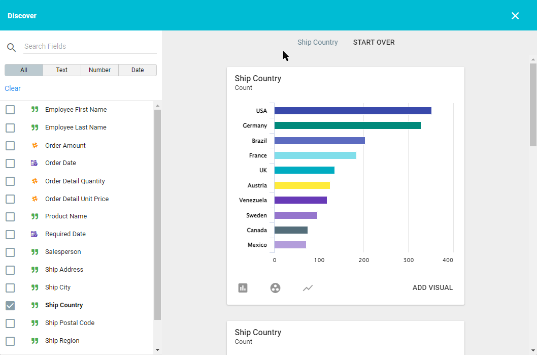
Create a Visual using Discover by selecting Discover from the Add Element menu. Check the boxes next to the Fields in the left panel to generate Visuals for the selected Fields. Once one or more Fields are selected, click Add Visual in the bottom-right corner. Click the X in the top-right corner to return to the Report. For more, see How to use Discovery Mode.
Saved Visuals
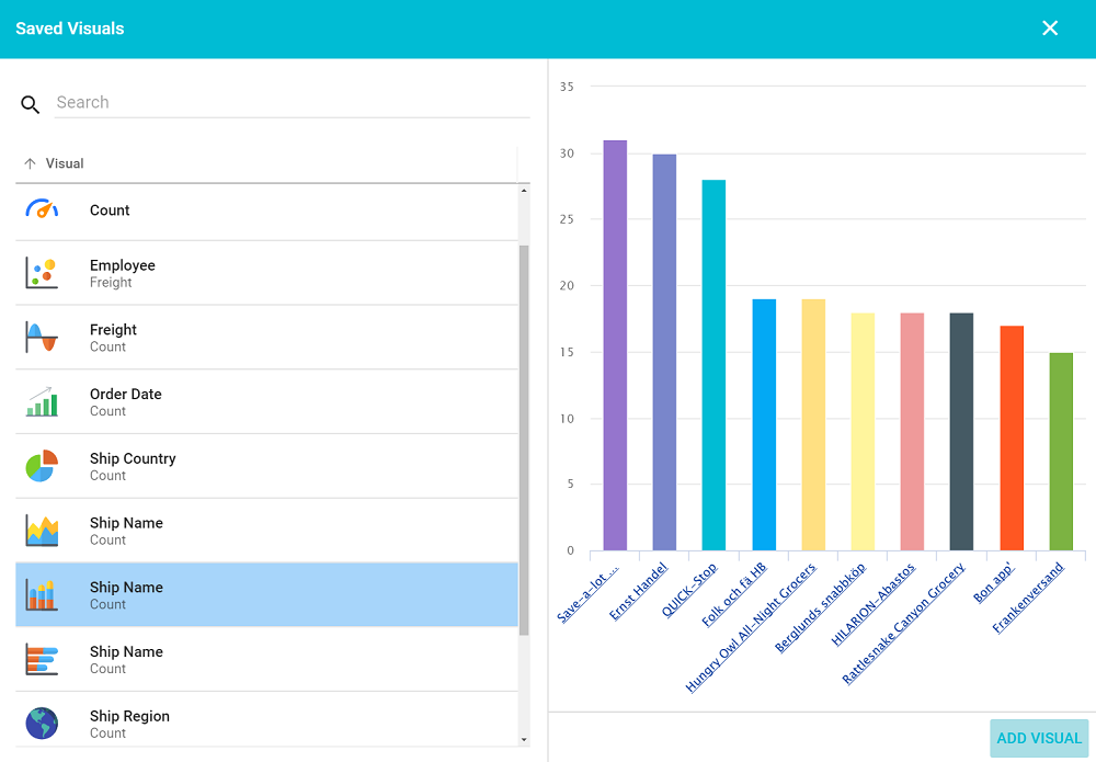
Add a saved Visual from the Dataset by selecting Saved Visuals from the Add Element menu, choosing the Dataset that contains the Visual (if there is more than one), then choosing the Visual from the list. A preview displays in the right panel. Click Add Visual in the bottom-right corner to add it, then click the X to close the window.
New Visual
Create a new Visual for the Dashboard from the Add Element menu. Select the type of Visual in the sub-menu, choose the settings, then click Save to add it. For more on configuring different Visual types, see the Visual Configurations chapter.
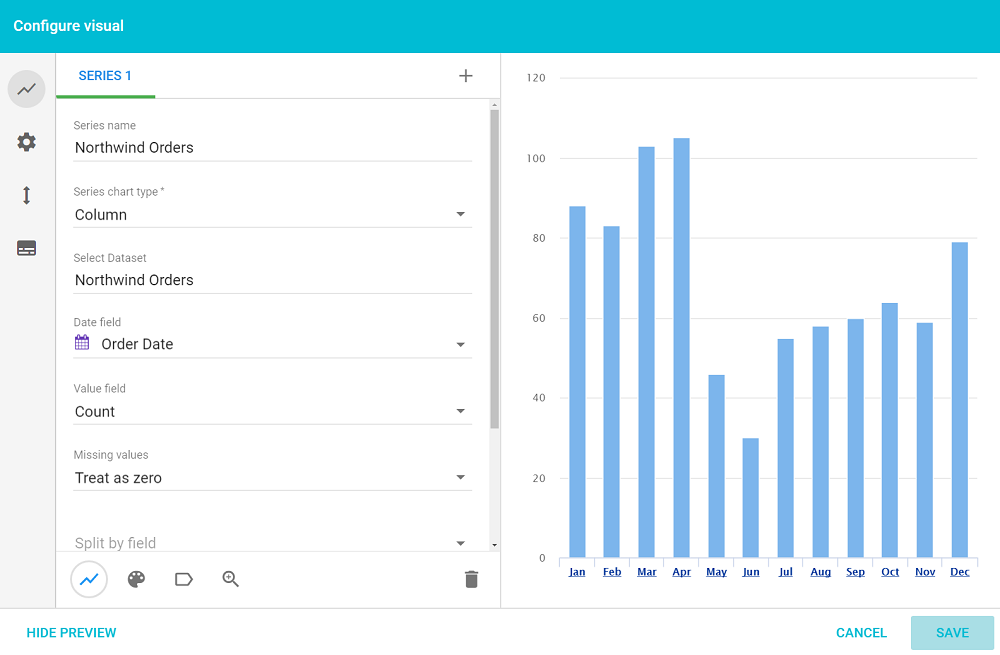
A Visual can use multiple series from more than one Dataset.
Once an Element is added to a Dashboard, the Visual has a number of options available. The buttons at the top are the same across all Visuals.
- Applied Inputs: applies an Input filter to the Visual. The options are All Filters, No Filters, or Select Filters.
- Move: snaps panels to the top of the Dashboard, the bottom, or to a Panel.
- Actions: opens the Configure panel to edit the Visual, rename it, or remove it. This menu also shows when the data was last refreshed from the Dataset.
The bottom buttons vary based on the type of Visual. See each Visual for the specific options available.
Inputs
A special type of Visual for Dashboards is the Input. An Input can be a Date Range, a Distinct Value, a Number Range, or a Text Box. Once added, Inputs let Users filter the data they want to see. See Dashboard Input Filters for more.
Panels
A Panel is a special type of Visual that holds other Visuals. When creating a Panel, you can name it, show or hide a border, and show or hide a title bar. Panels offer the same Configure, Rename, and Remove options as other Visuals.